Reply With Quote


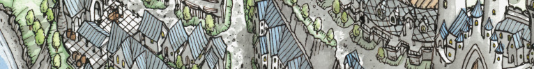
Oooh! Lovely. I do enjoy your line art. Hehe, it's always fun to see someone post a map publicly for the first time.
Just a quick question, is there a reason why all the names start with small letters? It is a bit odd since it is names.
And if I want to go into finer details, I'd say the grass tufts are great and all, but a bit over used. Someone once told me, empty space helps a map sometimes. Since if a map it is too busy, it can be distracting. (I often have to tone down stuff on my maps.) In this case, I'd tone down the grass tufts by like a third, and rather add some faint dots to show the contours of the land.
Anyway, that's nitpicking.
I like the map. A good forest, cool sea monsters and all!