Page 1 of 2 12 LastLast
Results 1 to 10 of 18

Thread: First map! The Country of Maze

Hybrid View

Previous Post Previous Post   Next Post Next Post
  1. #1
    Guild Novice Gus's Avatar
    Join Date
    Aug 2009
    Location
    Brasilia - Brazil
    Posts
    14

    Wip First map! The Country of Maze

    So, time for showing some work, shall we? This is the map I could make by using two great tutorials: the one present in Jeremy Elford's portfolio and the ones given by Ascencion.

    WIP-Maze2.jpg

    The original file is bigger: 3000x3000, 300dpi. This is the country of Maze, a medieval stage which originaly is supposed to be a Spain-oriented land. The map presents the version I am working on so far, making this country more diverse. The country remains mainly a spanish medieval country, but now is divided into 5 provinces: Madrid, a purely Spain; Andalucia, which reflects more the spanish colonies (Mexico, many on South America, etc...) Madeira, more oriented to Look like Portugal & colonies; Roma, an italian (and of course roman) province and Atenas, the Greece contribution. The cities names (yet to be positioned), cultural aspects and other minor details will reflect each influence. But the spanish is still the most dominant culture, because it is the most frequent everywhere, forming a squeleton which binds everything together (and prevents the country from tearing into 5 nations). The colorless landmass at northwest is Kahun, a different country which shares borders (and a lot of mutual resentment) with Maze.

    The map itself was made using Photoshop CS4. There are no cities because my Inkscape just decided to go nuts and don't cooperate. I am not satisfied with the current result and will warmly welcome any suggestions and criticisms.

    UPDATE: Maze 1.1

    Maze1dot1.jpg

    This is the first update to the map of Maze. First off, I took care of announcing the archipelago of Ve. These islands actualy are part of the original land, and I worked on them right from the beggining, but as an epic example of "d*mn I'm tired"-ness, I ended up uploading a version of the map without them. Don't ask me how I did it. This island, for the sake of curiousity, acutaly is not a province as the others are. Instead, the area is pretty much a headquarters of the country's most proeminent religion. Sort of a Vatican-like municipality.

    Following, some minor alterations to the texture. I was kinda annoyed that a map whose border had gemstones was made in such a crappy paper. The texture is the same, but smoothier (and also makes easier to notice the "fiberish" texture. The new compass is one of the C.M. Perry's pack. The "ocean lines" also were remade. I even tried to make them look a bit less precise, by adding a very brief ripple filter. The last minor alteration is that the provinces' colors faded a little bit. I am having some serious issues about leaving them colored, but I can't see a better alternative for differencing them.

    Now, the mountain ranges. Thank you guys! The tip was worth my weight in gold. I used Saadek's pack, which looked good enough. D*mn, I realy want to use that fantastic tutorial ironmetal250 gave, but I lack a good scanner (and patience) at the present moment. Maybe in the future, in another map.

    So... suggestions, criticizes. Anything, please. I'd like specialy to have some River Police evaluation. The "minor sea veins" re not much of concern (my commmunity likes to leave the least important concerns vague, giving players more freedom to set their scenarios). The big deal are the "reference points", the Rivers Azul and Verde. Here, a brief description of each:

    The river Azul (Blue) is born at the "Presas Blancas", or "White Fangs", as you may preffer (worthless note#1: trying to find it an alternative, greek term, as the range is Atenas' territory). basicaly it's a long, broad snake which cuts the ocean 'till reach Lake Esperanza. It is suitable for navigation in most sections (although in others the current and bottom makes it too difficult).

    The River Verde (green, because its color is more teal), despite what it looks, actualy is born at some no-name mountain at north (and not at the Gigantes Vacios, the Hollow Giants). The river , when reaching the range, does not go uphill. Instead, the highly porous terrain makes the waters to sink. Them, the river goes underground (the range has many, many caves. Hence the name). Eventualy, the water returns to surface through the many springs at south. From there, the waters goes to Esperanza. Also enables navigation.

    The Largest lake in the country, Esperanza actualy is a huge crater flooded. At south, it leaks, forming the River Esperanza, which meets the sea.


    UPDATE: Maze 1.2

    Maze1dot2.jpg

    What changed: With a very few exceptions, I had to start all over again. Blame the messed up rivers I made. Due to situations beyond my control, currently I am being forced to use this old trackball mouse I (luckly) had here. So, tapering rivers was what hystory experts categorize as "Spanish Inquisition torture".


    Making rivers took a significant amount of time and failures. But after reading a great tutorial for tapering rivers with Inkscape, I think I finaly made it. I love this site. If it was a girl, I would marry it. Ladies and gentleman, let's give Hai-Etlik a big hand, and some rep as well. I just had to follow his tutorial and roughen the lines a little bit, as I don't like much perfectly drawn river borders. But that's just me.

    I don't know if the rivers are alright this time, but they were much easier to do. I tried to follow the suggestions given carefully. You can see that the tributaries now are as much as pointed, giving the rivers a bit more zig-zag (but not too much). For the lines, I did the Smooth selection trick, but added a weak Liquify for messing them up. For the country's divisions, I tried copying the continent shape and them go Jack on them. This way I can keep shapes for any future projects concerning this map.

    Othen than that, I just tried to give the paper texture a little less "clouds" and a touch of "Fibers". The province of Andalucia was renamed to Durango for Role-playing purposes (now it will reflect Spain's colonies, while the center is more a pure Spain), blah, blah blah blah blah, and the like. As usual, suggestions and criticizes are warmly welcomed.

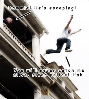
    Random humor: I planned to post that pic while going crazy about the rivers.

    UPDATE: Maze 1.3

    Maze1dot3.jpg

    This one is a small one. Only tilted the colors very briefly and reworked on the frame. I think the gems are better now.
    Last edited by Gus; 09-07-2009 at 02:57 AM. Reason: Adding a 1.3 (final?) version.

  2. #2
    Community Leader Facebook Connected Steel General's Avatar
    Join Date
    Jun 2008
    Location
    Ft. Wayne, IN
    Posts
    9,530

    Default

    Looks pretty good so far, though I don't think the mountain and forest symbols you've chosen "mesh" well with the map style.
    My Finished Maps | My Challenge Maps | Still poking around occasionally...

    Unless otherwise stated by me in the post, all work is licensed under a Creative Commons Attribution-Noncommercial 3.0 United States License.


  3. #3
    Community Leader Facebook Connected Ascension's Avatar
    Join Date
    Jun 2008
    Location
    St. Charles, Missouri, United States
    Posts
    8,392

    Post

    I'm with Steel on the mountains but damn dude, that's pretty nice.
    If the radiance of a thousand suns was to burst at once into the sky, that would be like the splendor of the Mighty One...I am become Death, the Shatterer of worlds.
    -J. Robert Oppenheimer (father of the atom bomb) alluding to The Bhagavad Gita (Chapter 11, Verse 32)


    My Maps ~ My Brushes ~ My Tutorials ~ My Challenge Maps

  4. #4
    Guild Novice Gus's Avatar
    Join Date
    Aug 2009
    Location
    Brasilia - Brazil
    Posts
    14

    Default

    I am terribly stuck and can't find any solutions. Can anyone give me a tip about which style suits better?

  5. #5
    Community Leader Facebook Connected Ascension's Avatar
    Join Date
    Jun 2008
    Location
    St. Charles, Missouri, United States
    Posts
    8,392

    Post

    Well, the thing is that they all look the same...some bigger some smaller but all carbon copies (or very close to being that way). Try varying what they look like, give them some different shapes for the peaks and ridges. Also, add some rounded foothills. Lastly, and this is my opinion that no one ever listens to, you might want to make them the same brown as on the coastline since you are using that as an outline (ie hand drawn with pen and ink) color. Take a look in the Mapping Elements section for a thread by Wag on mountains.
    If the radiance of a thousand suns was to burst at once into the sky, that would be like the splendor of the Mighty One...I am become Death, the Shatterer of worlds.
    -J. Robert Oppenheimer (father of the atom bomb) alluding to The Bhagavad Gita (Chapter 11, Verse 32)


    My Maps ~ My Brushes ~ My Tutorials ~ My Challenge Maps

  6. #6
    Guild Novice Gus's Avatar
    Join Date
    Aug 2009
    Location
    Brasilia - Brazil
    Posts
    14

    Default

    Map updated. Please see first topic.

  7. #7
    Community Leader Facebook Connected Steel General's Avatar
    Join Date
    Jun 2008
    Location
    Ft. Wayne, IN
    Posts
    9,530

    Default

    I like the update, though your labels on the mountains could use some kind of glow or stroke - they get kinda lost in the symbols.
    My Finished Maps | My Challenge Maps | Still poking around occasionally...

    Unless otherwise stated by me in the post, all work is licensed under a Creative Commons Attribution-Noncommercial 3.0 United States License.


  8. #8
    Guild Apprentice Wag's Avatar
    Join Date
    Jul 2008
    Location
    Northern Minnesota
    Posts
    47

    Default

    The map looks great so far. The color palette is fantastic!

    The land lines around the continent are a little "generated" looking to which I sympathize. It appears you used the "expand selection" technique from Ascension (which is a fantastic look) but has some difficulty in making it look natural. I've had some luck with the "liquefy" filter and messing with the area to take away any straight lines and add a more natural look. I would suggest giving it a shot.

    I also see you're giving my mountains a trial run. One thing to keep in mind is that you can erase parts of the mountains after you've placed them. For instance where your rivers start you could use a soft eraser to remove any overlapping mountains. This also works where you have the mountains placed very near each other just to clean up any overlap.

    I would maybe try firmer borders between colors as well. Slimming them down to give them slightly more definition on the border itself and possibly feathering out the shadows of the borders a bit more.

    I know it might be a lot of work, but I think a little more taper to the rivers from start to finish (just the big ones) might lend itself well. Also more defined river beginnings might aid in a more natural look. The current fade out works ok, but doesn’t look very natural by comparison with the rest of the map.

    It's a fantastic start thought, keep up the good work!

  9. #9
    Community Leader Facebook Connected Ascension's Avatar
    Join Date
    Jun 2008
    Location
    St. Charles, Missouri, United States
    Posts
    8,392

    Post

    Something that I've been messing around with on those ocean lines is when you make a selection, on the selection window there is a function called Smooth...this reduces the jaggies and rounds things off. Then you can expand the selection, turn it into a path, and then stroke it and not get the straight lines.
    If the radiance of a thousand suns was to burst at once into the sky, that would be like the splendor of the Mighty One...I am become Death, the Shatterer of worlds.
    -J. Robert Oppenheimer (father of the atom bomb) alluding to The Bhagavad Gita (Chapter 11, Verse 32)


    My Maps ~ My Brushes ~ My Tutorials ~ My Challenge Maps

  10. #10
    Guild Novice Gus's Avatar
    Join Date
    Aug 2009
    Location
    Brasilia - Brazil
    Posts
    14

    Default

    Somebody help me __ __". I am trying the suggestions given. Wag, I hate you. I know the rivers are pretty suckish but I everytime I sit down for starting them (even the border ones, even if you didn't said so) I get one of those lightning bolts. Result: more zsnes procastination. I swear that if I keep like this Crono will reach lv. 99 before saturday.

    Anyone, I beg with all my essence: a good river tutorial/trick for photoshop which may help me without trashing the map and starting all over again. Or, if you don't, at least some words of motivation.


    Oh, my God. I'm becoming Tracy Butler.

    PS: About the others' suggestions, I will try them as soon as I solve this dilema.
    Last edited by Gus; 08-27-2009 at 09:08 PM. Reason: Desperate cry for help.

Page 1 of 2 12 LastLast

Tags for this Thread

Posting Permissions

  • You may not post new threads
  • You may not post replies
  • You may not post attachments
  • You may not edit your posts
  •