Page 1 of 4 1234 LastLast
Results 1 to 10 of 36

Thread: Map of Serth

Hybrid View

Previous Post Previous Post   Next Post Next Post
  1. #1
    Guild Apprentice
    Join Date
    Sep 2008
    Location
    New Zealand
    Posts
    43

    Post Map of Serth

    Hi

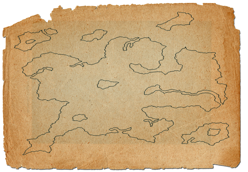
    I have recently started work on my first map made entirely in photoshop. It is a map of Serth, the world that my horror RPG takes place in.

    What iv done:
    drawn outline
    put on parchment

    Still to do:
    add mountains
    add forest
    add places
    add labels
    add measure
    add compass

    Image:


    Any C&C on what i can change/improve would be appreciated

    thanks
    Keeghan

  2. #2
    Community Leader Facebook Connected Steel General's Avatar
    Join Date
    Jun 2008
    Location
    Ft. Wayne, IN
    Posts
    9,531

    Default

    The weathered parchment is fantastic, and it looks like the paper is sitting on a slightly tilted blotter or something. Looking forward to seeing more.
    My Finished Maps | My Challenge Maps | Still poking around occasionally...

    Unless otherwise stated by me in the post, all work is licensed under a Creative Commons Attribution-Noncommercial 3.0 United States License.


  3. #3
    Guild Apprentice
    Join Date
    Aug 2008
    Posts
    37

    Default

    The paper is top notch.

  4. #4
    Guild Apprentice
    Join Date
    Sep 2008
    Location
    New Zealand
    Posts
    43

    Post

    thanks guys, im a bit worried about the coast lines, they just look a bit, odd, what do you kind people think?

  5. #5

    Default

    The coast lines is on apr with the fact that it's sitting on an old, weathered piece of parchment. One could deduce that it was done in a time when knowledge of cartography was at it begining. This would be a very nice handout to the players i think.

    Pat
    The truth detective
    www.patoumonde.com

  6. #6
    Professional Artist mmmmmpig's Avatar
    Join Date
    Dec 2007
    Location
    Columbus, Ohio
    Posts
    463

    Default

    I think the coast lines could use some smoothing. They seem to be almost pixelated and blocky. Zoom way the hell in and smooth the buggers out. Also I would suggest some line width variation as well. That might authentic it up a bit as well.

    Great parchment texture though.
    Something witty and pithy

  7. #7
    Guild Apprentice
    Join Date
    Sep 2008
    Location
    New Zealand
    Posts
    43

    Post

    smoothing... yes, good idea, ill try that, and its pixelated, because... i enlarged it, about 300% from its origanal to put it onto parchment and ;line width varyation, as in, make some parts of the line thicker? ok, i guess that would make it look for like it was drawn with a calligraphy pen, i have a reall dip pen blah blah thing, so ill spend a bi of time drawing lines, and see what they look like, and try recreate it thankls everyone for the encoraging words

  8. #8

    Post

    Quote Originally Posted by mad_computer_user View Post
    i enlarged it, about 300% from its origanal to put it onto parchment
    Never do that. If that's a hand-drawing you started with, just scan it at higher resolution, so you don't have to enlarge to fit the parchment. You can always reduce from a high resolution down to a lesser one. You'll only get problems doing it the other way around.

    Otherwise, I see a nice start and no ones given you any "Rep" yet, so I did.

    GP
    Gamer Printshop Publishing, Starfinder RPG modules and supplements, Map Products, Map Symbol Sets and Map Making Tutorial Guide
    DrivethruRPG store

    Artstation Gallery - Maps and 3D illustrations

  9. #9
    Guild Apprentice
    Join Date
    Sep 2008
    Location
    New Zealand
    Posts
    43

    Post

    YAY rep thanks man. and its not hand drawn, i made it in photoshop, but made it to small, i wanted a larger map, so i just enlarged it. I think i still have the ORIGANAL psd file, which if i enlarge, wont matter... though, ill need to then redo the:
    blur
    fading
    rotating of land

    but that will only take about 20 mins, ill do that.

    EDIT: BLURGH!!! i dont have the file any more not fair... hmm, what shall i do? i could redraw, but i like it the way it is, what do you people think?
    Last edited by mad_computer_user; 09-26-2008 at 11:05 PM.

  10. #10

    Default

    It almost looks "stretched" left-right. I think this is because all the long lines are horizontal.

    Some suggestions
    -Turn the peninsula in the upper left corner 90 deg. so that it has a vertical orientation
    -Do the same with some of the islands.
    -Or, scale the whole thing down so that it is narrower.

    Or do what your creative inner eye tells you to do and ignore this stranger. ;-)

Page 1 of 4 1234 LastLast

Tags for this Thread

Posting Permissions

  • You may not post new threads
  • You may not post replies
  • You may not post attachments
  • You may not edit your posts
  •