Results 1 to 6 of 6

Thread: Almost-my-first map (small region map)

Hybrid View

Previous Post Previous Post   Next Post Next Post
  1. #1
    Guild Novice absinthesparrow's Avatar
    Join Date
    Aug 2009
    Location
    California
    Posts
    8

    Default Almost-my-first map (small region map)

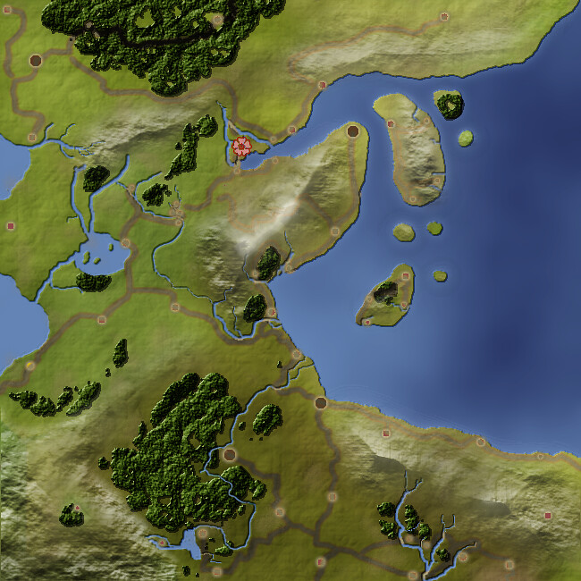
    Hi. This is my first non-reply post here, I lurk a lot but I haven't really done a lot of mapping up until now so I've never posted.

    I'm working on maps for my husband's next D&D game. This is the map of our starting kingdom, which I've been working on for about a week in GIMP. I used mostly the GIMP region tutorial for this.

    Any comments and suggestions would be much appreciated. I'm only just getting the hang of GIMP, and some of this definitely frustrated me. :p The roads, in particular, are not making me happy...


    (Neither is the city placement, but the mighty DM did that so I can't change 'em. >.> much.)


    Of course, now that the kingdom map is finally done, he handed me a scrawled world map at lunch. : / This'll be interesting... his idea of a continent is a round blob. Time to use my imagination!

  2. #2
    Community Leader Guild Sponsor Gidde's Avatar
    Join Date
    May 2009
    Location
    Michigan, USA
    Posts
    3,673

    Default

    Props for delurking! Great use of RobA's tut there. You may want to tone down (ie reduce the opacity) of the snowcap layer a bit; it completely wipes out your bump map in places. Other than that, it looks great! Can't wait to see the world

  3. #3
    Guild Journeyer hohum's Avatar
    Join Date
    May 2009
    Location
    Phoenix, AZ
    Posts
    166
    Blog Entries
    3

    Default

    Good job. I agree with Gidde about the snowcaps, you can reduce the opacity or apply the bump map to them as well. As for the roads you can try a smaller size brush/pencil. You might also want to take a look at the ink tool, I used it for the first time in Gidde's hand drawn tutorial and found it quite nice to work with (with a tablet anyway). I would also play with the forests to reduce the shininess and hard edge. Perhaps Gidde could enlighten us on what she did for her most recent map for her aunt.

  4. #4
    Community Leader Guild Sponsor Gidde's Avatar
    Join Date
    May 2009
    Location
    Michigan, USA
    Posts
    3,673

    Default

    I'm actually thinking of revising my forest tutorial to incorporate some lessons learned from that map, hohum. Thanks for noticing

    Sorry absinthe, I somehow missed your comment on roads. You could try filling them with a brown at low opacity, then changing the layer mode on them to grain merge; that will give them more of a dirt-in-the-ground look. Not sure exactly what look you're going for, but grain merge is almost always a good idea for roads; it stops them from feeling like they're floating above the ground.

  5. #5
    Community Leader Facebook Connected tilt's Avatar
    Join Date
    May 2010
    Location
    Trelleborg, Sweden
    Posts
    5,787
    Blog Entries
    2

    Default

    hi there absinthe, very nice first map.. and so much better than a blob ... I'd make those roads a lot smaller, if they shall fit the look of the map. No wider than your thinnest river ... I don't no GIMP but a negative bevel of 0 can help putting the road in place. The city icons could use a little strengthening, they are a bit blurry - try making them with just a hard brush, that should work.
    And I have to try on my new Morningstar of rather nice repping +5 - so have some
    regs tilt
    :: My DnD page Encounter Depot free stuff for your game :: My work page Catapult ::
    :: Finished Maps :: Competion maps - The Island of Dr. Rorshach ::
    :: FREE Tiles - Compasses :: Other Taking a commision - Copyright & Creative Commons ::
    Works under CC licence unless mentioned otherwise

  6. #6

    Default

    It appears that you outlined the roads in a different color, and at intersections that looks a little weird. If you painted over the outline at those intersections with the color of the center, it would make them appear to join more smoothly. And I also would suggest making it smaller, like Tilt recommended. You'll usually never see a road as wide as a city.

Posting Permissions

  • You may not post new threads
  • You may not post replies
  • You may not post attachments
  • You may not edit your posts
  •