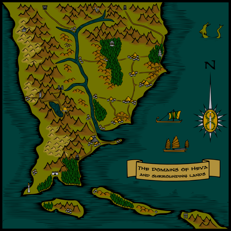
I just completed this map. It's a regional map for the D&D campaign I'll be starting in the next couple of months. My players will be using it as a jumping off point for learning about the campaign setting and figuring out where their characters are from.
I'm posting two versions, one with the regional labels turned on and one with them turned off. Personally, I think the large regional labels detract from the map when they're on. Unfortunately, I neglected to figure out where they were going going to go when I was in the early stages of planning this image.


 Reply With Quote


