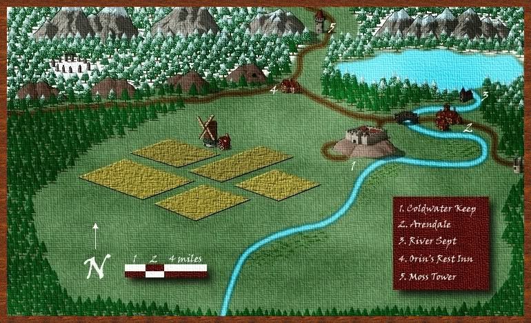
Hey all - this is my first attempt so be gentle!
I used CC3 and then Gimp to add the finishing touches. This is for a campaign I'll be running soon.


Hey all - this is my first attempt so be gentle!
I used CC3 and then Gimp to add the finishing touches. This is for a campaign I'll be running soon.

Very interesting isometric style! Have some rep.
Everything looks nice, except for these two things I think:
1. The border is very plain and doesn't fit the map (maybe it's the color).
2. The canvas effect is dominating the map at the moment. Try to soften it up a bit... the canvas was probably done with Gimp, so you can mess with the configuration.
Check out my City Designer 3 tutorials. See my fantasy (city) maps in this thread.
Gandwarf has fallen into shadow...
Looks nice, especially considering it's your first map
Yesterday today was tomorrow.
My deviantart: http://darkaiz.deviantart.com/
What a little nice map (or nice little map) !
I like the perpective effect, well done.
Noon
***************
My website : http://www.lechemindenoon.com
A project of role play (with my maps): www.rhim.fr
I like the isometric perspective, too, and the way that everything fits together. I do wish it were a little less pixelated in places, particularly the snowy trees. You might be able to play with that in Gimp, but don't blur it up too much...it looks great as is.

Thanks for the input guys - I wondered about the border as well. Any suggestions on how to make it more appealing?


excellent concept, and not a bad first map in the lest
www.jaredblando.com
Freelance Cartographer/Conceptual Artist
:My Patreon Account:
https://www.patreon.com/JaredBlando
:My First Book: How to Draw Fantasy Art and RPG Maps: Step by Step Cartography for Gamers and Fans
:My Second Book: Fantasy Mapmaker: How to Draw RPG Cities for Gamers and Fans


I like it a lot. I think the canvas effect really helps to subdue the cartoony feel of CC3. Nice job.
If the radiance of a thousand suns was to burst at once into the sky, that would be like the splendor of the Mighty One...I am become Death, the Shatterer of worlds.
-J. Robert Oppenheimer (father of the atom bomb) alluding to The Bhagavad Gita (Chapter 11, Verse 32)
My Maps ~ My Brushes ~ My Tutorials ~ My Challenge Maps

In general, I like isometric maps, and I don't like CC3.
Now, this isometric map, which I love and think looks very nice, was made in CC3.
It is a very nice map, and as other people have said, I like the woven canvas feel.