I figured since I JUST joined. I would show what I have been working on.
The maps you are about to see are my creation of a Fictional Modern City for a Super Hero Universe (Though it could likely be used for anything in the modern world).
I chose the area because of the vast amounts of water around it and this location in New Jersey seemed perfect (Particularly for a Super Hero world... Close to Wash DC & New York).
I am probably going to show you the completed map (well, as complete as it is now). Though I may post the original template map later on (Which will show you the amount of work I did)
I do realize these maps do not have a lot of clarity (Due primarily to me shrinking them and pixel issues - originally they were indeed sharper - just unwieldy).
It does do exactly what I need it to for the game I am presently using it in.
I have to say I do love how the general (Modified) layout from the original area turned out (using satellite imagery).
I have some nicely detailed blown up areas worked on (Specifically three). Though I may post them at some later date.
Anyhow...
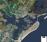
Here she is... My Metro City, New Jersey (Mapped over Ocean City, Somers Point, Beesley's Point and various empty islands).
Here is a micro of it (Though I would honestly suggest using the link after the micro pic to look at the full image)
That you can of course balloon up to the 'still' monstrous one.
Though this link lets you skip the Photobucket screen and flat out shows the larger map.
http://i161.photobucket.com/albums/t...TYareasMAP.jpg
The Above image I also have with nothing on it (No indicator numbers).
You can see the unmodified area that I have yet to get at on the map (and for the moment deemed unimportant to me) in the upper right hand corner. Where it looks extremely dark (Which a lot of the islands had a similar look).
A lot of trial and error went into trying to retain some detail and heighten the colors.
I wasn't nearly as successful as I would have liked to have been.
BUT... like I already said. I have been highlighting certain areas, blowing them up and increasing the detail.
So it still works as a general 'YOU ARE HERE!" map. Heh!
It could certainly look better. But it isn't bad for my first time trying to make something of that level (That wasn't hand drawn).
That's it.
My first entry into this forum.
G7


 Reply With Quote