Hey, all.
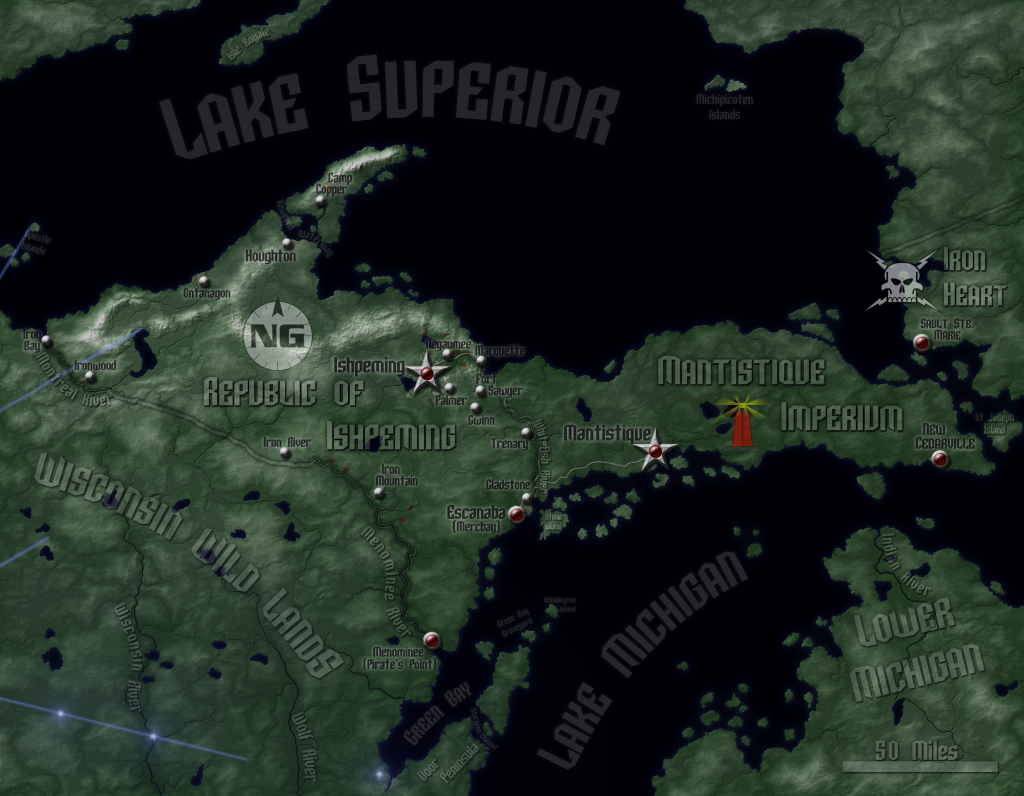
I did a good bit of work on a map based on the Rifts RPG over the holidays, but I came to a point where I had trouble deciding a few key issues. Here's the map:
(Note: the actual image size is larger than this, but the website won't allow a 3300x2600 map to show up in all its glory. Neither will Photobucket, but it shows enough for you to get the idea. Sorry if some of the labels are a little hard to read)
Here are the design issues I'm having:
1. The most-glaring one deals with the blue glowy lines and spots. In Rifts, these are important areas known as ley lines, and a points of intersection is an especially important place called a nexus. There is a pair of ley line nexuses in neighboring Wisconsin that I placed on the map based on text from the game, but I can't find any canon references on the actual ley lines that intersect there (where they go, how long they are). I like their look, but without intersecting ley lines, the map just feels incomplete. Do I invent ley lines and slap them in, or do I just delete the nexuses?
2. I haven't done any kind of border art for the map. Rifts is a kitchen sink game, and many different themes could work, but I'm not sure which, if any, to run with. A fancy painting frame? A beat-up Northern Gun computer display? A Coalition intel file? A magic map from the Lazlo Council of Learning's archives? Or should I just stick with a minimalist approach, keeping the focus on the terrain itself and allowing people who want a hard copy to adjust and print without having to worry about having to crop here and there?
3. The map lacks a legend and compass rose, which I've held off on until the previous issue is resolved, since I'd want those features to match the theme of the frame, if I do one. Of course, since up is north on this map, it seems a bit redundant. How important is the legend and compass rose to you?
4. The water. I've experimented with a few different techniques for doing water in previous maps; the one I have for NG right now works, but it's a bit plain. Do I go for a flowing, textured look that doesn't really convey any practical information but looks cool, an underwater topography render that might have some utility for underseas types but tends not to look as good, or do I stick with something simple to help accentuate all the land details I've done? Or should I try something new?
5. Although it looks good on a computer screen, the map is not yet optimized for physical printing; it would probably come out way too dark at this point. Do I optimize for print or for screen display? Is it feasible to optimize for both?
6. Should I keep the color in Mantistique's logo, or should I keep it black and white, like the other two?
7. How is the color? I have a minor color vision impediment when it comes to greens. I can see them, but it can be hard to judge the right levels of saturation.
Of course, any other suggestions or critiques would be welcome.


 Reply With Quote
