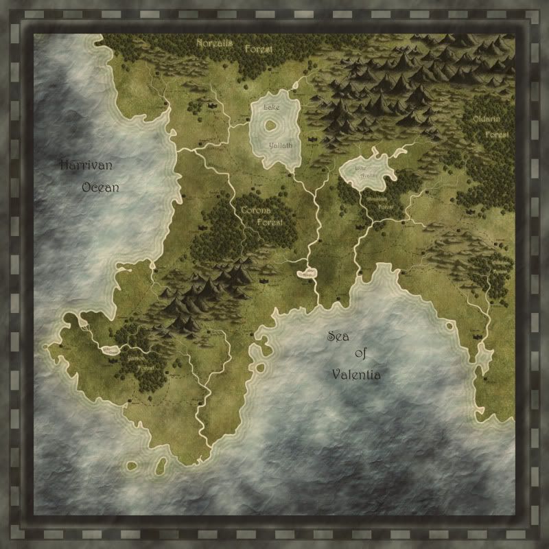
I like the look. One thing - the large lake is pretty unlikely to drain in two directions. Depending on your peoples' level and their needs of transport you could make one of the outlets a canal instead of a river ...
Or... you might want to check out the thread in the Mapping Elements section that Fluesopp started called "Automatic Forester."
It's not perfect yet but is pretty damn good. I know Fluesopp is rewriting it from the ground up and I am currently working on his original version to try and improve the look of the forests when they are packed in real tightly. But there are working versions already in the thread.
As to your map... I really like it. I love how you've done the sea with the crumples suggesting the waves. It looks great. I also like your texture work on the land too. Really looking forward to watching this progress further.
Well done.
Royal: I'm very sorry for your loss, your mother was a terribly attractive woman.
My Cartographer's Guild maps: Finished Maps
More maps viewable at my DeviantArt page: Ramah-Palmer DeviantArt
I like the look. One thing - the large lake is pretty unlikely to drain in two directions. Depending on your peoples' level and their needs of transport you could make one of the outlets a canal instead of a river ...
I really like how you did the combi of semi-realistic atlas style and mountain/forest symbols, looking forward to seeing this progress. cheers
Very nice indeed.Can't wait to see when it's labeled.
It's been a while, but I've continued to work on this map last week. Thanks for all the advice! I've decided to keep the trees as they were (mostly because it took me a little too much time to consider redoing it... Lazy, I know), but I'll keep all the advice in mind for the next try.
I've started putting in the castles & towns, the lables and the roads. Let me know what you think.


it looks beautiful, rep floating your way... and speaking of floating - only one river should float from a lake... if you have the time, upload a higher resolution version so we can see the details of the towns and roads

regs tilt
:: My DnD page Encounter Depot free stuff for your game :: My work page Catapult ::
:: Finished Maps :: Competion maps - The Island of Dr. Rorshach ::
:: FREE Tiles - Compasses :: Other Taking a commision - Copyright & Creative Commons ::
Works under CC licence unless mentioned otherwise


much better - now I can see the little houses... looking good, and good you fixed that river too

regs tilt
:: My DnD page Encounter Depot free stuff for your game :: My work page Catapult ::
:: Finished Maps :: Competion maps - The Island of Dr. Rorshach ::
:: FREE Tiles - Compasses :: Other Taking a commision - Copyright & Creative Commons ::
Works under CC licence unless mentioned otherwise


That's all-around great looking. That is a beautiful and innovative way to do the oceans - just awesome. Repped!
Well Done!!!! Like the overall look of the map.
In the words of Most interesting man in the World. "Stay thirsty my friends."
Unless otherwise stated by me in the post, all work is licensed under a Creative Commons Attribution-Noncommercial 3.0 United States License.