ntto!I must admit, doing scenes with my wife was the most fun Ive had with Poser.
Another masterpiece, Digger! Just a very minor observation, but my eyes were immediately drawn to the bright fingernails...was that the intention?


Wow, nice! Very ResidentEvil-esque. I love the grunge.
Gidde's just zis girl, you know?
My finished maps | My deviantART gallery
My tutorials: Textured forests in GIMP, Hand-Drawn Mapping for the Artistically Challenged
ntto!I must admit, doing scenes with my wife was the most fun Ive had with Poser.
Another masterpiece, Digger! Just a very minor observation, but my eyes were immediately drawn to the bright fingernails...was that the intention?

no it wasnt intentional, I think they have reflected the overhead lights
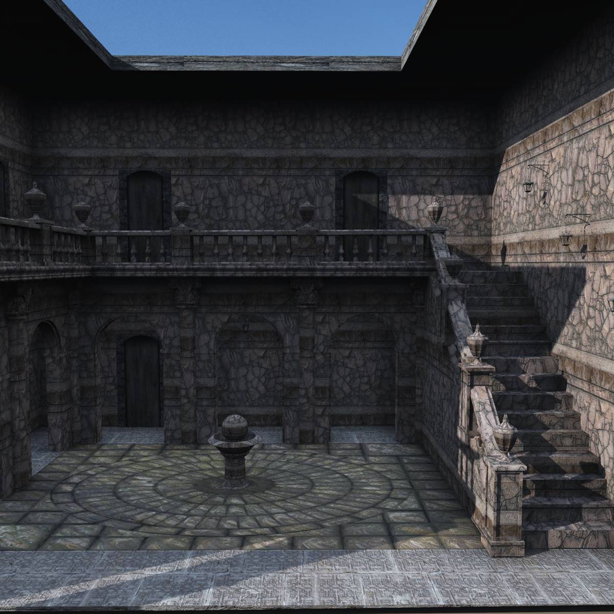
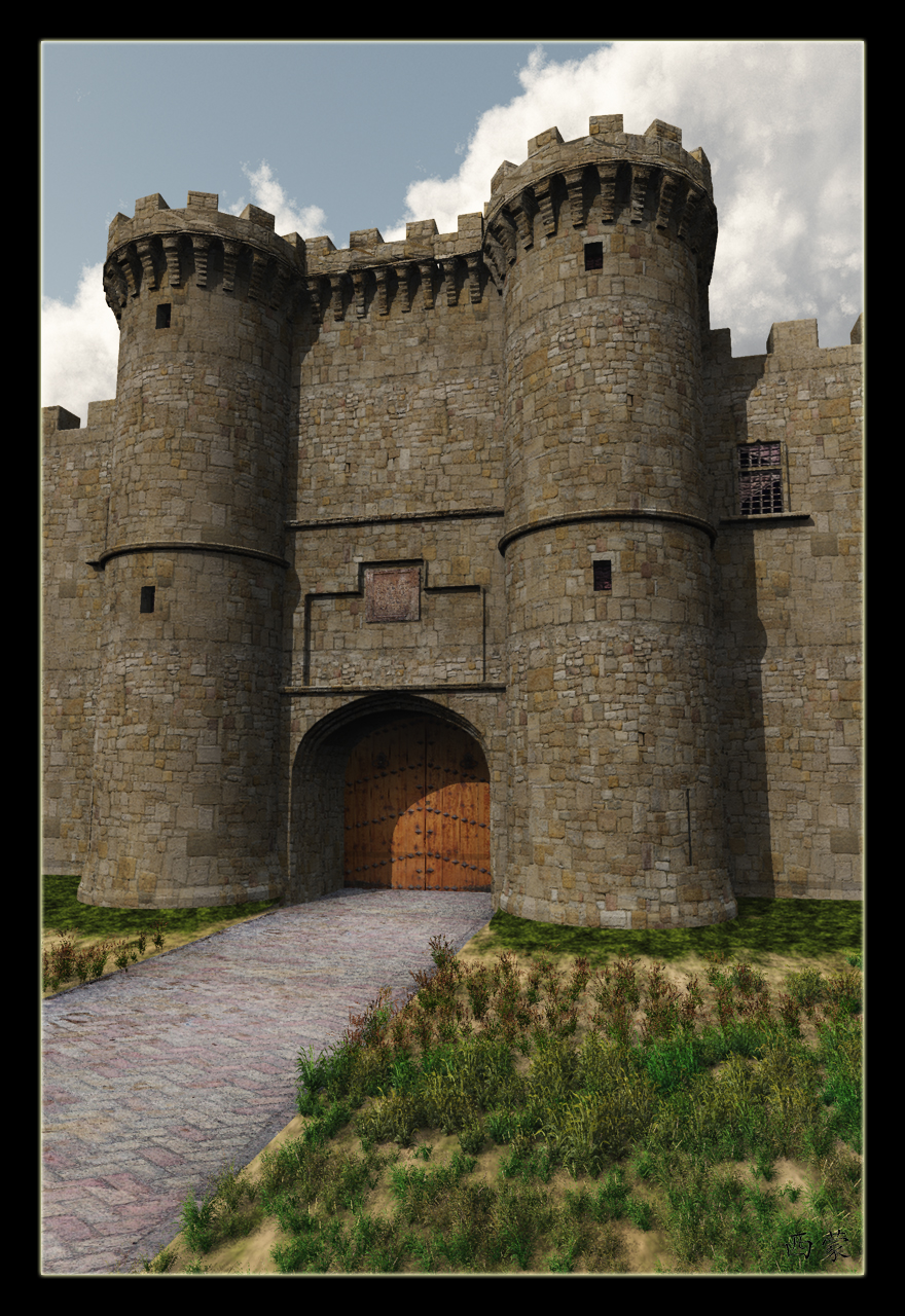
I just love the way 3d modelling allows me to create the place I visulalise when I create a scenario.
This was a building I made some time ago.

Last edited by Digger2000; 02-20-2011 at 07:38 PM.


You, sir, are making me really really glad I just spent that money on 3d software I don't know how to use (yet) because it was too good a deal to pass up. These are ALL simply gorgeous.
Gidde's just zis girl, you know?
My finished maps | My deviantART gallery
My tutorials: Textured forests in GIMP, Hand-Drawn Mapping for the Artistically Challenged
I just love the lighting. The lighting on my 3d stuff always looks too harsh.

I have found that the lower you can set your lighting the better the image looks.

Last edited by Digger2000; 02-21-2011 at 05:41 AM.
Enjoying these images. I think so far I like the one above (top) the best. The lighting is really dynamic and strong but all of them have great lighting - are any done with radiosity ? You have great texturing work going on all of them too. I am interested in how you modeled your wife too. Was that still with Vue or something else. I liked the "killing him off" pic too tho her legs have collapsed at the hip. I guess the software is still not allowing extreme folding on models yet. I wrote one of those once and its real hard to get right. I think you need to know more than just the poly shape to do it so it looks right. Good stuff !

I used Face Gen modeller for my wifes head then parented it to V4 head, and made the V4 head see through, as for texturing Im crap at it so I cheat, most of my models dont have a UV map, I just throw textures at them and see what they look like at different settings.
http://www.facegen.com/index.htm
Also with the lighting I try lots of different Vue atmo's and see what looks best.

Sometime its a matter of getting the right orientation for the textures that make the image look right.
For example the Arches on the below image.


Finding a good place to get textures helps, here's a good free resource.
http://agf81.deviantart.com/