Results 1 to 6 of 6

Thread: Hand drawn map test.

  1. #1
    Guild Apprentice
    Join Date
    Jan 2012
    Posts
    46

    Default Hand drawn map test.

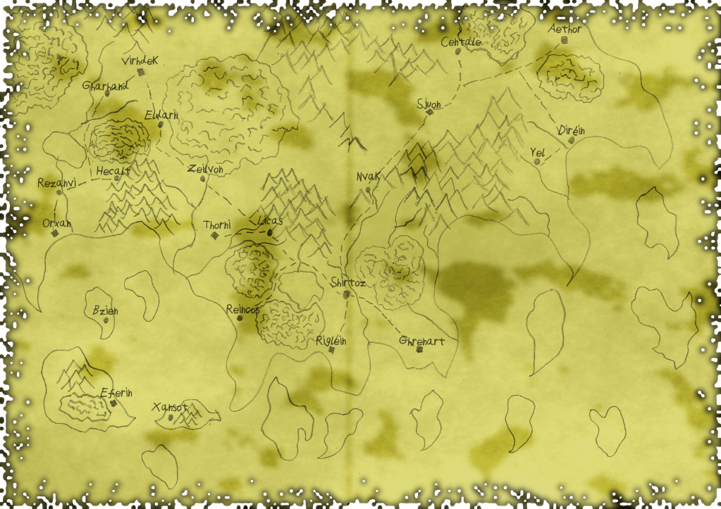
    Ok, so this map was done by me, with Pencil and Paper, I just used gimp to add the burnt/old parchment look on to the map. This might be used for Pathfinder setting. (Note I'm making my dad buy them three core books ('Core book' 'Game Mastering' & 'Bestiary'...) Going to bugger him till he buys them , *is evil* on another note, I'm running a sandbox session for him using D&D 3.5e first tomorrow.) Anyways back to the point I was getting bit off topic! The map... It was fairly easy to do, anyone can make it if they know how to draw lines and triangles and how to use GIMP. I want some critique on this and as an extra I will throw in a challenge for fun. Imagine what the other part of the world looks like! If the map does not upload I will just use photobucket link.


  2. #2
    Guild Artisan Freodin's Avatar
    Join Date
    Oct 2010
    Location
    Germany
    Posts
    513

    Default

    The map itself: not bad. Nice geographical layout, no major problems I could see. The islands on the lower left side could use a little reworking... this left-squiggle-tail part obviously came from the drawing, not from design.
    The style: you said it yourself, lines and triangles, easy stuff. Not bad for a sketch, for a polished result you'd need to be a little more precise in your lines. The spaghetti-treetop-little-wiggly-lines might give a better result if you keep the horizontal.
    The background: well, it looks... a little wierd. The greenish colour is quite uncommon, though not bad. You might want to try some other, more regular paper colours though. The dark spots are to strong for this map... they overwhelm your drawing. And at the border, you should definitly get rid of the free-floating parts.

  3. #3
    Guild Apprentice
    Join Date
    Jan 2012
    Posts
    46

    Default

    Quote Originally Posted by Freodin View Post
    The map itself: not bad. Nice geographical layout, no major problems I could see. The islands on the lower left side could use a little reworking... this left-squiggle-tail part obviously came from the drawing, not from design.
    The style: you said it yourself, lines and triangles, easy stuff. Not bad for a sketch, for a polished result you'd need to be a little more precise in your lines. The spaghetti-treetop-little-wiggly-lines might give a better result if you keep the horizontal.
    The background: well, it looks... a little wierd. The greenish colour is quite uncommon, though not bad. You might want to try some other, more regular paper colours though. The dark spots are to strong for this map... they overwhelm your drawing. And at the border, you should definitly get rid of the free-floating parts.
    [img]http://i1188.photobucket.com/albums/z402/Nocte32/RandomHanddrawnWorldV2.png[/image]

    Like this coloring? Better or worse? Free-floating parts? You mean those islands? Oh, I will just have to find a way :p

    EDIT: I deleted those islands and added plasma on top of the yellow color. What do you think now?

    [image]http://i1188.photobucket.com/albums/z402/Nocte32/RandomHanddrawnWorldV3.png[/img]
    Last edited by Kazou; 05-05-2012 at 02:27 PM.

  4. #4
    Guild Artisan Freodin's Avatar
    Join Date
    Oct 2010
    Location
    Germany
    Posts
    513

    Default

    Better, though I personally would prefer something a lot more subtle. But that's your call.

    The "free floating parts" I am referring to are the unconnected "blots" or "bits of paper" at the very border of your paper-texture. I can understand a paper that is, err, moth-bitten at the edges... but what would keep the little unattached bits in its place?

  5. #5
    Guild Apprentice
    Join Date
    Jan 2012
    Posts
    46

    Default

    Quote Originally Posted by Freodin View Post
    Better, though I personally would prefer something a lot more subtle. But that's your call.

    The "free floating parts" I am referring to are the unconnected "blots" or "bits of paper" at the very border of your paper-texture. I can understand a paper that is, err, moth-bitten at the edges... but what would keep the little unattached bits in its place?
    Oh, sorry didn't quite get you , gonna get rid of those now.

    There, now what do you think?

  6. #6
    Guild Journeyer octopod's Avatar
    Join Date
    Jul 2008
    Location
    Ann Arbor, Michigan
    Posts
    135

    Default

    Maybe shading the coastlines in the direction of the ocean would make it a little easier to read?

Posting Permissions

  • You may not post new threads
  • You may not post replies
  • You may not post attachments
  • You may not edit your posts
  •