Nice! Keep playing with it, I think it has great potential!

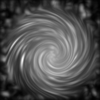
A while back I was all "Ugh, how do I make a decent looking map of a galaxy for doing sci-fi poo with?" about a week and a half later I came up with this. It lacks detailed labels because there's basically zero associated worldbuilding. Otherwise I'm interested to know how to improve on it. Made with GIMP.
Nice! Keep playing with it, I think it has great potential!
Very Nice! it remind me the maps from "Mass effect" videogame
Just a note: maybe the central area is a bit too bright
spirals still look like elliptical galaxies , but with arms .
-spiral
http://images.nationalgeographic.com...86_600x450.jpg
http://scitechdaily.com/images/Spira...ly-Thought.jpg
-elliptical
http://spiff.rit.edu/classes/phys240...1_ware_big.jpg
http://lainfo.es/en/wp-content/uploa...44-web_m31.jpg
then there is the "irregular"
http://whillyard.com/science-pages/u...-irregular.jpg
http://ftp.aao.gov.au/images/image/aat064.jpg
and the "globular cluster"
https://upload.wikimedia.org/wikiped...47tuc_salt.jpg
https://upload.wikimedia.org/wikiped..._deceptive.jpg
my first thought on it is
there is a mis match in the arms
one side has more than the other
spirals have the same number of arms on each side with some more tightly wound than others
this is how i have made them in the past
-- a very quick 1 min. galaxy and small , in gimp
used gmic plugin to make a plasma noise and a radial gradient
then the "iwarp" ( this is being removed in the next release and being replaced )

Last edited by johnvanvliet; 09-21-2015 at 04:45 PM.
--- 90 seconds to Midnight ---
--------
--- Penguin power!!! ---

Interesting, so I did go and read up on some density wave theory and I think that'll probably help me produce more scientifically accurate galaxies in the future. Also I did something very similar to what you did that to make my base black and white image.

I decided I'd keep going with this thing before I try generating a more accurate galaxy. If anything I think this at the very least has the right kind of look to it. I adjusted the brightness and coloration a little and decided to rework the overlays and stuff.

Looking good, the dimming down of the centre brightness is a good move, keep us updated.
Very good already. Looking forward to see more.

I'll upload a new version, but at this point I'm mostly just screwing around with my world building stuff.

i love it you get such a feeling of power of each empire.