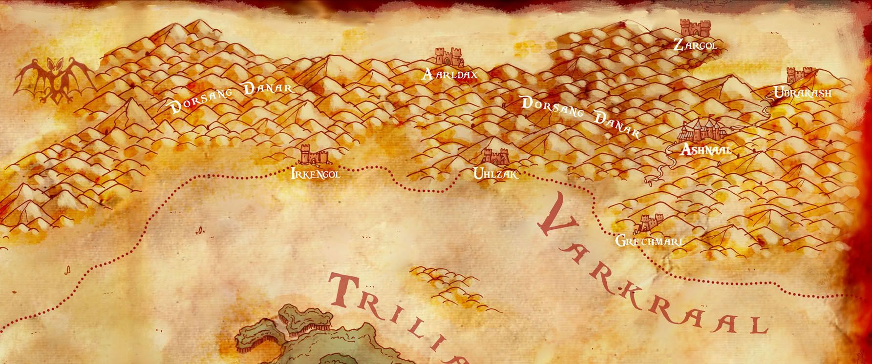
And the maps for Bill...
Hit me up with some comments, always appreciated
~Jared


Hey all,
Been some time since i posted, mostly due to my work and other more personal issues. Happy to update and bring you some of the work i have been producing lately, especially this large map for DGS (dead Generals' Society) who have permission to use my map in publication(though i retain ownership).
Also got some Personal maps i did for a member here on the guild, Bill4747.
Check it out, and check out my updated website and new section(and other work besides maps) on my website...
www.theredepic.com
Detals:

Last edited by TheRedEpic; 10-04-2008 at 12:19 AM.
www.jaredblando.com
Freelance Cartographer/Conceptual Artist
:My Patreon Account:
https://www.patreon.com/JaredBlando
:My First Book: How to Draw Fantasy Art and RPG Maps: Step by Step Cartography for Gamers and Fans
:My Second Book: Fantasy Mapmaker: How to Draw RPG Cities for Gamers and Fans


And the maps for Bill...
Hit me up with some comments, always appreciated
~Jared
www.jaredblando.com
Freelance Cartographer/Conceptual Artist
:My Patreon Account:
https://www.patreon.com/JaredBlando
:My First Book: How to Draw Fantasy Art and RPG Maps: Step by Step Cartography for Gamers and Fans
:My Second Book: Fantasy Mapmaker: How to Draw RPG Cities for Gamers and Fans
Wow, you have a very cool, unique style. I love these maps. The cities and villages that are just sketches (and not pencilled in) on the last maps are a nice touch. I like the top map most though, I think. The forest, mountains and cities are vere well done. As is the water and the parchment effect. I can't think of any critique, only that I wish I was as good as you
Repped!
Check out my City Designer 3 tutorials. See my fantasy (city) maps in this thread.
Gandwarf has fallen into shadow...
I like the freshness of the colours especially
Repped, for justice!
I can barely believe my eyes over just how fantastic those maps are! All the little touches like the animals, icons, etc blend into the maps perfectly. By far the best thing is the strong coloring. It just makes the maps look so lively and catches the attention right from the first glance.

Very cool stuff!
My Finished Maps | My Challenge Maps | Still poking around occasionally...
Unless otherwise stated by me in the post, all work is licensed under a Creative Commons Attribution-Noncommercial 3.0 United States License.


Thanks everyone for the comments!
www.jaredblando.com
Freelance Cartographer/Conceptual Artist
:My Patreon Account:
https://www.patreon.com/JaredBlando
:My First Book: How to Draw Fantasy Art and RPG Maps: Step by Step Cartography for Gamers and Fans
:My Second Book: Fantasy Mapmaker: How to Draw RPG Cities for Gamers and Fans
The color is unique. I really like the way you pulled everything together.
The road to success is always under construction.
Beautiful maps, the digital colour job looks very traditional (good thing)
Also I love the font choice.
My only critic is that I find the edges of the map, which are very cool and well done, take a bit a way from the work of the map itself. I think a less emphasize on the edge will really draw into the cool original artwork of the inside.
-Terry


Last edited by Schley; 10-05-2008 at 09:08 PM.