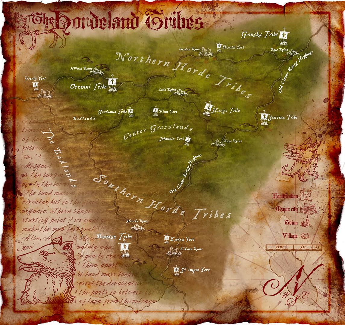
Wow, those are great! I'll be a little contrarian and say I really dig the arted-up parchment edges. They turn this from merely a map to a display of art, imho.
Very pretty maps indeed. I love the effect of the white text on the map - it stands out surprisingly well.

Wow, those are great! I'll be a little contrarian and say I really dig the arted-up parchment edges. They turn this from merely a map to a display of art, imho.
I think, therefore I am a nerd.
Cogito, ergo sum nerdem.
Check out my blog: "The Undiscovered Author"
It's the story of a writer... follow me in my simple quest to get published, and share your own writing stories, adventures and writerly tips.
Pimping my worldmap here. Still WIP... long way to go, but I'm pretty proud of what I've done so far...
I've really dug your work ever since I stumbled onto it at deviantART.
In particular, I really like the balance of many colors with the old, worn map look.
My only question is if in the world of your Isarshael map, there is a country named Koronna Light??
Current Project: The Low Countries & Their Periphery, c. 1584
Do you like Renaissance and early modern history? Check out my Facebook page, Renaissance Netherlands with Will Phillips.
Kudos, great style - repped - I love the quality in everything!
Back to the parchment border issue - I love the use of parchment, especially damaged and folded effects, however, in the case of your maps it seems more a "framing" of the art, rather than an effective parchment styled map.
What I mean, when I use folded, damaged parchment, the color, texture, damage and fold continues across the entire map, done carefully not to overly distract from the map itself.
The art is so clean, that it clashes with the parchment - just an opinion.
Otherwise great stuff.
GP
Gamer Printshop Publishing, Starfinder RPG modules and supplements, Map Products, Map Symbol Sets and Map Making Tutorial Guide
DrivethruRPG store
Artstation Gallery - Maps and 3D illustrations


Thanks for all the comments guys, very helpful.
The border ideas from everyone are all good, looking back, i really need to tone down the borders, they are too busy for there own good! In the next couple maps, i will calm the borders and try not to frame the piece.
Thanks a bunch everyone, should have some work coming out soon
www.jaredblando.com
Freelance Cartographer/Conceptual Artist
:My Patreon Account:
https://www.patreon.com/JaredBlando
:My First Book: How to Draw Fantasy Art and RPG Maps: Step by Step Cartography for Gamers and Fans
:My Second Book: Fantasy Mapmaker: How to Draw RPG Cities for Gamers and Fans


Just finished this one, tried to tone down the borders, check it out.

Last edited by TheRedEpic; 10-17-2008 at 01:06 AM.
www.jaredblando.com
Freelance Cartographer/Conceptual Artist
:My Patreon Account:
https://www.patreon.com/JaredBlando
:My First Book: How to Draw Fantasy Art and RPG Maps: Step by Step Cartography for Gamers and Fans
:My Second Book: Fantasy Mapmaker: How to Draw RPG Cities for Gamers and Fans
I love the mood of this map Red. It also just looks legit anf authentic. Great art skills too.
Torq
The internet! It\'ll never catch on.
Software Used: Terranoise, Wilbur, Terragen, The Gimp, Inkscape, Mojoworld


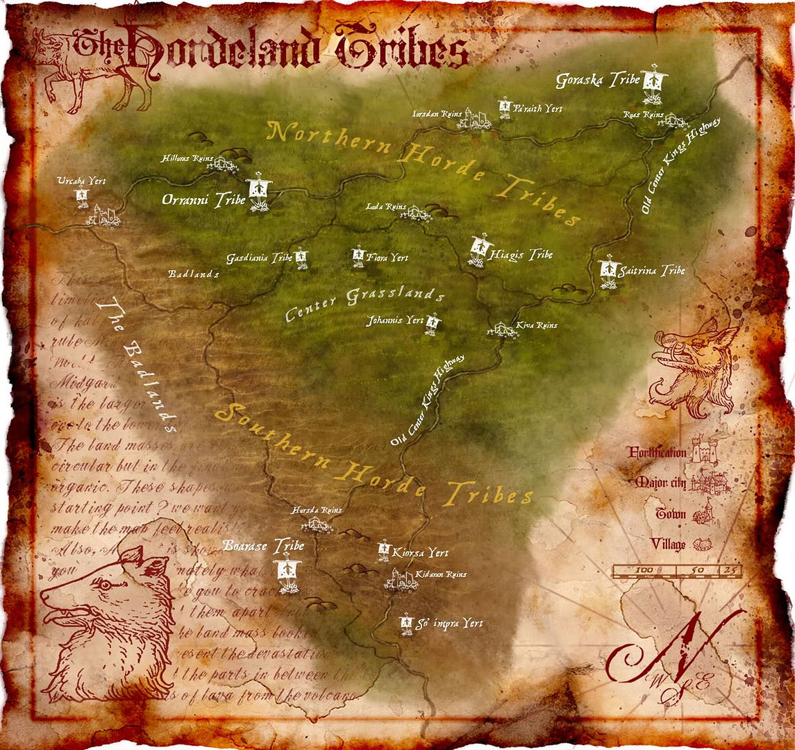
Hey all, made this maps background a bit lighter since i thought the first post was a bit dull, and i changed the color of the tribe text, what do you guys think?

Last edited by TheRedEpic; 10-17-2008 at 02:12 PM.
www.jaredblando.com
Freelance Cartographer/Conceptual Artist
:My Patreon Account:
https://www.patreon.com/JaredBlando
:My First Book: How to Draw Fantasy Art and RPG Maps: Step by Step Cartography for Gamers and Fans
:My Second Book: Fantasy Mapmaker: How to Draw RPG Cities for Gamers and Fans
yes, prefer the second. Its more lively with brighter stronger colors. Its a very nice bit of art.
I love your style.
In fact I'm a bit more of a fan of these types of maps then that of the more "artsy" ones.
I'd love to learn how to make similar maps.
FEAR NO EVIL