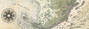
This is a very attractive piece, though I'm thinking you must have had sore hands from drawing at the end of it!!
I love that big compass. It really draws the eye and is a great focus of attention. The hatching on the border & title is absolutely gorgeous. I love it! On the labelling, I don't find the labels hard to read, but they don't really stand out when you're zoomed out. Normally that would be something I might comment on, but hey, if that's what the client wants, then you've done a good job!
"We are the music makers, and we are the dreamers of dreams"
As I said : a very good job with the scale and size. At the first glance, everyone can see it's a world map !
Looks great!
Can't rep you right now but I will be back.
Very nice map, I like it a lot!
What I found helps a lot mith making small lables stand out/legible (next to choosing an appropriate font) is mainly two things:
1. paying attention to contrast between background and font color
2. Avoiding any small high contrast detail (such as line drawing, certain textures, etc.) behind or even near text - if at all possible. Fonts themselves are essentially just an arangement of small high contrast lines. Any detail that fights with that, will just result in a loss of clarity, because the eyes and brain will have a hard time telling the two apart. So for me it is usually a good idea to keep the areas around labels as clean as possible.
Cartography by Matthias Rothenaicher. Portfolio: Website | DeviantArt
Superb. I love the size and shape. The Serpent's Bridge is my favourite story hook. Nicely done.
Merci beaucoup Joël
Grazie mille Filippo
Vielen Dank Matthias and especially for your labeling advice, they'll be put to use, be sure of that I gotta learn to anticipate the labelling issues. It was not possible here as the client sent me the names after the map was done but I guess slightly erasing or hiding some linework details might work.
Thanks a lot tgraybam
Finally getting a chance to take a proper look at this map. You've done an outstanding job again, Thomas! The curved hatching looks great, and I love how it comes back in the border, compass and title. And you've done a great job on the labels! I can imagine that being a pain in the @$$, but you've nailed it. The only comment I have is that in the top-left a forest and country label overlap each other..
Great job, Thomas. Like others have said: that hatch pattern is really gorgeous. I do hope you used a custom pattern for that to avoid repetitive strain injury
With regards to the labels: I can see how they would be a nightmare. I'm a HUGE fan of putting off doing them, myself In addition to Matthias' labelling advice, I would like to add that a clearer hierarchy between the different types of labels could also help. I sometimes had some trouble distinguishing between the grey labels for the whole region (higher level), and the back ones for areas within that region (lower level), because they are roughly the same size, but the lower level ones (black) stand out more against the high level ones (grey). I don't have a ready-made solution, I'm afraid, but I would try switching the black/grey colours around, or decrease the size of the sub-regions' labels a bit.
Thanks a lot Daniel I had to break the labels into two maps and it wasn't even easy. I see what you mean about the overlapping, they're very (too) close.
Thanks Brian I only drew one quarter of the border and used it to get some symmetry. All the other hatched parts are unique It was quite a soothing meditation and not that long once you get the hang of it.
I see what you mean about the labels. I tried to reverse the grey scale but oceans popped too much and land labels were hard to read. I'm glad the client plans to ask for color, that'll give me more liberty to make them readable.