Originally Posted by
GrimFinger

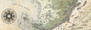
1. The way that you denote the various points of interest reveals considerable mastery. It's really well done, here.
2. The light squarish/rectangular borders surrounding the text entries for the points of interest are a relatively simple concept executed particularly well. They also help to make for an excellent mitigation of white space.
3. You incorporate textual variety effectively and in a precise manner. Different sizes of fonts, some with an white edge/highlight to them, and others with no edge/highlight, different kinds of fonts, some text is curved, some text is straight - lots of visual variety on display in this map, and it all blends well and enhances the overall look of the map.
4. Various small symbols underscore the professionalism and eye for detail that went into this map. A triangle, a square inside of a square, a keep, gates, and a circle that seems to extend beyond a square, but with the square's corners still showing - there's so much subtlety in artistic form in play on this map.
5. And the bottom and right edges, that's how the viewer is informed of distance on this map. That's a clever visual trick.
6. The terrain, itself, such as in the Valley of Wind (but not limited, thereto), it's just lovely stuff.
7. A map like this is very relaxing to just sit and look at. Nothing about it puts the eye off.


 Reply With Quote


