Nice art work.
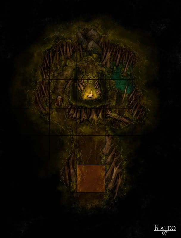
Though (since I don't know the game mechanisms) seeing a square grid overlayed on a isometric/aerial perspective just looks wrong to meIs there a reason the grids are square rather than iso?
-Rob A>


and a couple more...

Nice art work.
Though (since I don't know the game mechanisms) seeing a square grid overlayed on a isometric/aerial perspective just looks wrong to meIs there a reason the grids are square rather than iso?
-Rob A>
Lovely art work Epic.
Those are amazing, Jared. I'll have to look up that "Citadel" game--looks great & sounds intriguing. I still can't believe you use no filters on these; that's true talent!
Don
My gallery is here
__________________________________________________ _______
"Keep your mind in hell, but despair not." --Saint Silouan [1866-1938]
I agree. The richness of the color palette is just so good that it really makes you stay and admire the artwork. That looks like it will be a neat game, but I will have to abstain from giving it a go, as I find MMORPGs and the like are addicting and I just don't have the time required to really immerse myself.


Hey Guys,
Thanks amillion for the comments
To answer your question, the grid is overlayed over the isometric view so it shows where the player may walk the Standard WASD config allows the player to move only intot he boxes that are connected to each other.
I do think that on some i could have toned down the boxes even more, and i may still in the futre. The orange shaded boxes are "wilderness" boxes, where the play may exit and enter the map.
Personally, I find that mmorg's get very repetive and are not as sophisticated as a game like this one (they always seem to rely on too much game mechanics rather than story telling, as well as the combat being booooooring). And then again, this game may be too slow for the average user (which text based games are for a specific niche crowd anyway).
Here is a link to Trident games website for any that may be interested:
http://www.tridentgames.com/
Hope to have some more maps to post soon
~Jared
www.jaredblando.com
Freelance Cartographer/Conceptual Artist
:My Patreon Account:
https://www.patreon.com/JaredBlando
:My First Book: How to Draw Fantasy Art and RPG Maps: Step by Step Cartography for Gamers and Fans
:My Second Book: Fantasy Mapmaker: How to Draw RPG Cities for Gamers and Fans
Wonderful artwork, TheRedEpic! No need to guard your secrets, I fear- you're a true artist. Merely knowing the mechanics won't help us mortals replicate stuff like that!
I am surprised my prior photoshop works and experiments didn't click when I actually looked at your maps, nor when I read your little tutorial thing, when creating your water and probably the terrain do you use the "Forum Signature" techinques? Grundge, Fractal, Abstract brushes?
examples
http://img143.imageshack.us/img143/5117/yandor1wj0.jpg
http://img143.imageshack.us/img143/16/yandorfl9.jpg
mind you it may not be the "Exact" same but I just never really thought about it like that until I thought about making a signature for these forums
P.S. the person/character in the signatures are just renders taken out of high quality art pictures =D