


I was talking about the map, not the border. It would be hell to shade ! And the subtle color works very well.

I was talking about the map, not the border. It would be hell to shade ! And the subtle color works very well.
@jfrazierjr : it's partly intentional. I like the drawn-like style due to a the line width variation. But, I did the mistake to do the coastline without the rivers at first, hence the noticeable difference at the rivers's mouths...
@Kacey & Thomrey : thanks. I'm reworking the colors, though. I used more layers and one is for an additional shading with the colors. What do you think?
Also, I'm wondering about the additional illustrations on the other countries... People/characters/animals of the different principalities/provinces, or heraldry?
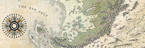
### Latest WIP ###
Empire Batikshal.jpeg
I think the heraldry you had had since the beginning is the best option. I am looking for forward to seeing the colors getting filled in.Originally Posted by Ilanthar

I would like to see the forests toned down just a little bit(but I am kind of wishy-washy on this point though and can't really make up my mind!).
as for the line work.. it was an annoyance, but the more I look at the map and all of the features in aggregate, while it still bugs me some it's less distracting knowing it's entirely reasonable for someone to have just drawn it sloppily "in character".
My Finished Maps
Works in Progress(or abandoned tests)
My Tutorials:
Explanation of Layer Masks in GIMP
How to create ISO Mountains in GIMP/PS using the Smudge tool
----------------------------------------------------------
Unless otherwise stated by me in the post, all work is licensed under a Creative Commons Attribution-Noncommercial 3.0 United States License.
Thanks! Well, I won't do much more drawings, indeed. I've done almost all the colors on the first layer... I still have to do the second layer which also serve as an additional shading, so I'm not sure it's gonna be so washed in the end.By jfrazierjr
I think the heraldry you had had since the beginning is the best option. I am looking for forward to seeing the colors getting filled in.
I would like to see the forests toned down just a little bit(but I am kind of wishy-washy on this point though and can't really make up my mind!).
Thanks! I don't exactly know how much time I spended to do it (and it's not finished by the way). Maybe between 35 and 45 hours.By Bjorn Schievers
Nice! How long has it taken you in total to do this map?
I also change the color for mountains.
### Latest WIP ###
Empire Batikshal.jpeg
I'm mostly done with colors and second (colored) shading.
I'm just not so sure about the buildings (my "reddish" tests are in the circles).Thoughts?
### Latest WIP ###
Empire Batikshal.jpeg


This looks amazing, maybe shadow one side of the rivers? Love the style
Looks amazing! Maybe paint the walls for the buildings a bit brighter or even white(-ish)? To get a little more contrast between them and their roofs. But they're fine as they are. I don't think anyone would complain about the color of the buildings.
A tiny bit more colour overall?
No?
If not, its lovely as it is, and I think the buildings you've done are right for the rest of the map, coloured just as it is
Free parchments | Free seamless textures | Battle tiles / floor patterns | Room 1024 - textures for CC3 | GUILD CITY INDEX
No one is ever a failure until they give up trying
I love the map, but since you asked I think the red looks pink, at least on my monitor. I don't mind the colour I just think it could be better. I think if you keep the walls of the buildings like this, and changed the colour of the roofs or vice versa it would look good. Right now the roof, and wall colours are too similar in my opinion, but like the others I still think it looks alright. If it were me I would tone down the pink on the walls, and make the roofs green, or make the walls more whiteish grey, and make the roofs more red, and less pink...
I think it's kind of funny that the nicest maps get the most nit picks

The more I look at it the more I like it. How much would this map have cost as a commission, on average?

 Reply With Quote


