Reply With Quote
It's looking fantastic.

Most likely i will have to put this aside for a while and switch to different project, so next udapte may take a while.
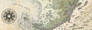
I deepened shadows on mountains and then made light brighter. It may look too white now, but it will darken when i add colour.
I also did the shade on forests. Colours change the value of light and shade when you later put it on top of your background parchment (unless you work with colour blending option), so to help me with the right shade tone i first painted it colour, then did the shadows. They're still missing light.
Unknow_wip_v1.6_Zatwarnicki_Rafal.jpg
New Horizons
Fantasy maps and illustrations.
All my non-commisioned maps are FREE for personal use. Get them at my home page New Horizons
Get more of my maps by becoming my Patreon.
Support:
Patreon | Tip via PayPal.Me | Buy Me a Coffee
It's looking fantastic.
"We are the music makers, and we are the dreamers of dreams"
Thank you ChickPeaOriginally Posted by ChickPea

Now fighting with the colours. Always the toughest part for me. It takes me several approcheas to actually nail down the right colour saturation and tone. Small steps but slowly moving forward.
Unknow_wip_v1.7_Crop1_Zatwarnicki_Rafal.jpg Unknow_wip_v1.7_Crop2_Zatwarnicki_Rafal.jpg
New Horizons
Fantasy maps and illustrations.
All my non-commisioned maps are FREE for personal use. Get them at my home page New Horizons
Get more of my maps by becoming my Patreon.
Support:
Patreon | Tip via PayPal.Me | Buy Me a Coffee
I think you may have got the colours just right in that second map anyway!
The map is stunning
Free parchments | Free seamless textures | Battle tiles / floor patterns | Room 1024 - textures for CC3 | GUILD CITY INDEX
No one is ever a failure until they give up trying
Mouse i read your comment couple times and i can't quite get what you mean
Both crops are different parts of the map. First is gonna be rocky and barren, hence grey colour, second is abundant with flora, so i used green. You mean that the colour looks ok on the second crop but the first one is a no-go ?
New Horizons
Fantasy maps and illustrations.
All my non-commisioned maps are FREE for personal use. Get them at my home page New Horizons
Get more of my maps by becoming my Patreon.
Support:
Patreon | Tip via PayPal.Me | Buy Me a Coffee
I love the red bushed between the scale-like mountains !
Oh - I thought those were two different maps! LOL!
The colours of the second crop are lovely, but that doesn't mean the first crop is wrong. If that's bare rock then its great - maybe a little more variation in the greys? Rock is all kinds of grey, but its probably something you've already tried and discarded as a bad idea
Free parchments | Free seamless textures | Battle tiles / floor patterns | Room 1024 - textures for CC3 | GUILD CITY INDEX
No one is ever a failure until they give up trying
Yes i tried that, but can not get it right. As a matter of fact i really strugge with this one. I cant get the colours right at all. Either map is too dark or too white. I may actually give up this one, or take a really long break
New Horizons
Fantasy maps and illustrations.
All my non-commisioned maps are FREE for personal use. Get them at my home page New Horizons
Get more of my maps by becoming my Patreon.
Support:
Patreon | Tip via PayPal.Me | Buy Me a Coffee
Maybe it is due to the parchment being darker.
That can really affect how colors look on a background.
As an example, many of mine would look wrong if I change the background color.
That's due to them being multiply layers.
Artstation - | - Buy Me a Kofi
Try a second fractionally more purply deep water colour. Maybe the shallow could then be edged towards aqua (closer to the green of the land), for purple-green harmony.
Colours aren't the easiest things to play with. Sometimes I google 'green paintings', 'blue paintings', colourful paintings, or something like that - steal colour ideas from other people's work. You could try that? Remember also that if you happen to like a painting you see for its colours, the balance is just as important. For example, if you find a glorious blue painting with a small amount of yellowish orange in it, the colours won't look any good used in an artwork where the proportion of those colours is different - where there is the same amount of both, or more of the yellowish orange than the blue.
You could even use that second extract to do an image search for similar images - see what you can find that is almost but not quite the same colour balance. Sometimes things can look wrong but only be very slightly 'off'.
I still really like that second sample.
Free parchments | Free seamless textures | Battle tiles / floor patterns | Room 1024 - textures for CC3 | GUILD CITY INDEX
No one is ever a failure until they give up trying
 Posting Permissions