Page 2 of 5 FirstFirst 12345 LastLast
Results 11 to 20 of 45

Thread: Ruin

  1. #11
    Professional Artist ThomasR's Avatar
    Join Date
    Nov 2015
    Location
    Angers, France
    Posts
    4,153

    Default

    Quote Originally Posted by J.Edward View Post
    Very nice Thomas
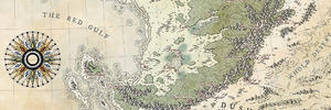
    Love the color scheme, bogs/swamps and fields.
    Two things that I like less would be the border, due to the layer style, I believe.
    It looks like it is on color burn possibly.
    And then the choice of font.
    That font is nice for a display font, for a title, but for location labels it feels a bit too busy and harder to read.
    I do understand the desire to use it for the feel of foreignness that it conveys.
    On any single location it looks fine, but when you get a bunch of them closer together the visual problems arise.
    All in all though, it is a splendid map Thomas.

    edit - drat, must spread rep.
    Thanks John ! About the border, it's plain black set to overlay with and overlaid frieze. I tried some moucharaby pattern but it did not work, I tried this "wicker" style and tried darkening it to stay tuned with the map. Leveling the parchment below might have helped not make it look golden. Anyways it's done.

    About the font, the client wanted something arabic-ish (most of the culture of the land is of arab style) and this one, XXI arabian onenightstand, was the one with the most character and legibility I could find. Talking with Abu Lafia, we agreed that the links and dots made it a bit hard to read sometimes but I decided to stick with it and find ways to make it more legible (uncurving some labels, playing with an outer glow at first, then a stroke, then outer glow again and finally several outer glows with different settings). Inspired by your maps, I wanted to use only one font (that's my first time). The main problem to me is the lakes region but that's where the adventure happens

    And thanks again, both for the compliment and for the advice on the font

    Quote Originally Posted by Wingshaw View Post
    I like this map. The colour palette works very well for the feel you're trying to give it. John's comments make sense, but, in my opinion, I don't think either the border or the font detract heavily from the map.

    Wingshaw
    Thanks Wingshaw ! About the colors, I used so few, that's almost disturbing when you look at the map without it's parchment background (hail the blending modes !).

    Quote Originally Posted by Mouse View Post
    Its a labour of love! All that fantastic detail.

    I sort of fall between John and Wingshaw with the border. I don't dislike it, but I think it might look better without the gold effect - just line work on the parchment. I kind of like the font
    Thanks a lot Sue ! I tried the frieze without the overlay and it was a bit too discret to my taste. Maybe I should try some middle ground option...

    Quote Originally Posted by DanielHasenbos View Post
    The map looks great Thomas! I like your choice of colors. Really down my alley. The font also works very well and the terrain is done beautifully. All in all just a great map (:
    Thanks Daniel ! I knew the subtle colors would suit you I did one exception and brightened the lakes (because they're highly salty). About the terrain, I'm quite happy with it, especially the rift's lips.

    Quote Originally Posted by QED42 View Post
    Very cool map but I especially like the font, it is a great fit.
    Thanks QED42 !

    Quote Originally Posted by Diamond View Post
    Snagged for my inspiration folder and repped.

    I love your mountains as always, and the forest is awesome! That's what I'm trying to accomplish with my forests. Thanks for another great example for me to study.

    As far as the border - that's actually one of my favorite parts of the map; I wouldn't change a thing. I kind of see where John's coming from r.e. the font/labels, but to me it doesn't really look too busy. It helps that you used different colors.

    I do have a question - where it says 'Great Underground River' - is the label actually following the course of an actual underground river? Or is it meant to be a label for the river leading from Freeport to Trest?
    Did I read right ? One of my maps in Diamond's inspiration folder ! Man, you made my day ! And it makes me happy to be able to give back to you a little, your maps have always been inspirations for me.

    Thanks for the mountains, as I said a few weeks ago, I'll have to make them evolve soon. Thanks for the forest, I guess what hits the spot is the shading. What exactly are you trying to get with them ? And thanks for the labels and border.

    About the West Underground River, I'm a bit baffled too. Caught that I was into the job, my daughter and the commissions, I completely forgot to ask the client if there was some mix up. I'll have to check and tell you. The river leading from Freeport to Trest is not actually a river but I guess you'll have to wait till the book is out (it might be what you liken you can cheek here).

    Quote Originally Posted by Alnomcys View Post
    Joli carte ! Les couleurs désaturées rendent bien l'effet voulu
    Merci beaucoup, j'ai un peu galeré au départ mais les tests ont vite été concluants, il fallait jouer l'économie. En plus ça collait à l'univers.

    Quote Originally Posted by FrancescaBaerald View Post
    Wow! Great map!!
    Grazie mille signora !

    Quote Originally Posted by Voolf View Post
    Great map, love the colours.
    I agree with J.E about the font. Looks good as a big labels for major namesm but small size and couple near each other is a bit messy.
    Congratz, its awesome map.

    Edit. Can't rep yet, sorry.
    Thanks Voolf !

  2. #12
    Administrator Facebook Connected Diamond's Avatar
    Join Date
    Jul 2009
    Location
    Boonsboro MD, USA
    Posts
    7,504

    Default

    Thanks for the forest, I guess what hits the spot is the shading. What exactly are you trying to get with them ?
    I just think that 'look' is so versatile, and works really well with the type of mountains that you and I draw. I did a really stripped-down version in that B&W map I did a few weeks back: here. But you're right, it's the shading that really makes it work, that and the subtle color variations. Just need to get back to practicing.

  3. #13

    Default

    Well, your 13th commissioned piece is surely memorable! Color scheme is not just wonderful, but it really tells a lot about the world (especially the color of the lakes); and that deep red you used for the labels adds a nice contrast.

    May I just ask about the size of this piece?

  4. #14

    Default

    Superb ! The color palette is a perfect match and I'm quite impressed by the way you handled the lands (the central part is a win). Excellent balance between shading and linework. I'm certainly gonna take some inspiration from this too .

  5. #15
    Professional Artist ThomasR's Avatar
    Join Date
    Nov 2015
    Location
    Angers, France
    Posts
    4,153

    Default

    Quote Originally Posted by Diamond View Post
    I just think that 'look' is so versatile, and works really well with the type of mountains that you and I draw. I did a really stripped-down version in that B&W map I did a few weeks back: here. But you're right, it's the shading that really makes it work, that and the subtle color variations. Just need to get back to practicing.
    Another thing I did to better smooth the transition between forest and mountains is to hide the treeline, if it can help you a bit. Of course, it cannot work on a B&W map.

    Quote Originally Posted by Shall Teclex View Post
    Well, your 13th commissioned piece is surely memorable! Color scheme is not just wonderful, but it really tells a lot about the world (especially the color of the lakes); and that deep red you used for the labels adds a nice contrast.

    May I just ask about the size of this piece?
    Merci beaucoup ! I'm glad tant you feel the decaying vibe I was after The map is planned for a book and is a bit bigger, size A4.

    Quote Originally Posted by Ilanthar View Post
    Superb ! The color palette is a perfect match and I'm quite impressed by the way you handled the lands (the central part is a win). Excellent balance between shading and linework. I'm certainly gonna take some inspiration from this too .
    Merci beaucoup Julien ! Diamond, then you, I'm rally happy I can inspire you as I've been in awe in front of your maps for a long time and that includes, the top notch production of your Tipee/Patreon ! Seriously, people, go check his Tipee/Patreon !

  6. #16

    Default

    Quote Originally Posted by ThomasR View Post
    Hi fellows,

    Here's my latest commissioned work (13th, that's a lucky number to me ... ok, to most of people). "Ruin" is an upcoming book by author Brandon Berryhill. The map shows a world on the brink of total ecological collapse hence the decaying color palette. I used very few colors and very desaturated ones. All was done in photoshop and I have to address special thanks to Abu Lafia who helped me a great deal as I stumbled upon a big rock of labeling on my way to the completion of the map.

    Attachment 99738
    © Thomas REY - All rights reserved - 2017

    As always, feel free to comment and critic.

    Hey guys. Writer of the book here. I just wanted to say how pleased I am with this work. It's super exciting to see my imagined adventures put to paper. Thomas did a wonderful job and has my vote! As he mentioned before, you are welcome to read the (unedited) story HERE.

    I'm heading to the store now to get some small hanging nails to put the printed version on my wall

  7. #17
    Administrator Facebook Connected Diamond's Avatar
    Join Date
    Jul 2009
    Location
    Boonsboro MD, USA
    Posts
    7,504

    Default

    Hey guys. Writer of the book here.
    So... what's the deal with the Great Underground River?

  8. #18

    Default

    By ThomasR
    Merci beaucoup Julien ! Diamond, then you, I'm rally happy I can inspire you as I've been in awe in front of your maps for a long time and that includes, the top notch production of your Tipee/Patreon ! Seriously, people, go check his Tipee/Patreon !
    Thanks, I'm glad we inspire each other ! I've been lazy with the Patreon... I think I may just have posted a fifth of what I've done for the Tipeee .

  9. #19

    Default

    Quote Originally Posted by Diamond View Post
    So... what's the deal with the Great Underground River?
    Someone mentioned earlier that the label may be off and I believe that is correct. The river is drawn onto the map between Freeport and Trest.

    If you are curious about the geological aspects of it, it is essentially a giant lava tube from millions of years past. I'm writing book 2 right now and, the chapter I'm in deals with this interesting feature.

  10. #20
    Administrator Facebook Connected Diamond's Avatar
    Join Date
    Jul 2009
    Location
    Boonsboro MD, USA
    Posts
    7,504

    Default

    Aha! I was right without even knowing I was right! A testament to Thomas' excellent mapping skills.

Page 2 of 5 FirstFirst 12345 LastLast

Posting Permissions

  • You may not post new threads
  • You may not post replies
  • You may not post attachments
  • You may not edit your posts
  •