Reply With Quote
Well, that's the easy part. Just set the sea level wherever you want it.Originally Posted by Obbehobbe

I'm out of town and don't have my files with me or I'd bash up a quick one to show you.

I don't know what the problem is but the map looks great to me


Well, that's the easy part. Just set the sea level wherever you want it.
I'm out of town and don't have my files with me or I'd bash up a quick one to show you.
Heh, thanks but no worries. I can do it myself!
"That sounds... incredibly complicated, but there's no doubt the result is fantastic." /Diamond
no problemAwesome, now in English? (Or Swedish preferably!) I'm not a Tech-mapper and I don't know if what you are writing is positive or negative! but please explain, I'm open for all kind of feedback!
as a few others have posted , it dose look nice
my area of expertise is in mapping a image/texture/map around a Sphere
-- not a easy task, mind you .
First
some map definitions and examples
a good reference
https://en.wikipedia.org/wiki/List_of_map_projections
-- Mercator
https://en.wikipedia.org/wiki/Mercator_projection
this is used in ocean navigation mostly , hence it is the MOST used
and can NOT be used near a pole
do to how math works the north pole would approach INFINITELY " ∞ "
hence the black circle in the center of the north pole reprojection i posted
A 90 north to 90 south Simple Cylindrical map would look like this
now a lot of the time a Mercator projected map will have " here be dragons" for a area not known or shown
so a white band for "snow and ice" on a not shown area is " not wrong" , but a easy out .
this is something i NOTICE do to testing peoples maps for a simulation program i work on
It is just NOT a good example for OTHERS to fallow .
the snow and ice cover up the ERRORS in mapping near the poles
on your map this is really not that bad ( i have seen WAY worse )
What i am getting at is this
If something is going to be in a book( or game) , should it not be a GREAT example for others to reference
i am betting you have a copy without the snow and ice
there are good ways to make the arctic areas look real
a quick example - 15 min so
ice removed
then with some new ice added
and remapped back
now what looks better ?
the north or the south ?
PS.
if you want i posted a while a go a 16384x8192 16 bit unsgined Heightmap
for Venus - new copy of it
https://drive.google.com/file/d/0B6Z...ew?usp=sharing
a 197 meg zipped tiff image
256 Meg unzipped
Last edited by johnvanvliet; 11-20-2015 at 11:22 PM.
--- 90 seconds to Midnight ---
--------
--- Penguin power!!! ---
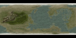
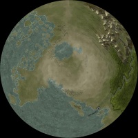
Alrighty, here I am again, this time with a remade version that looks more Venus-like. Though, I needed to take some things into consideration, like the description I was handed, and the width/height of the paper. Also, I needed a map with less water.
venus_105.jpg
Thanks Johnvanvliet for the real venus map.
"That sounds... incredibly complicated, but there's no doubt the result is fantastic." /Diamond
Have to second Azelors comment. Don't know what the issue is, I think this looks really good so far
Cheers,
Tainotim
Cool to see anoter MC map! Concerning Venus, I've struggled with the actual relief map and opted for quite a low-water level for my Elzevir setting. You have even less water already, and I assume you're going to place a lot of jungles. Great start anyway!
Thanks! Yeah, lots of more jungles and features. Probably going to make icons for citadels and cities aswell.
"That sounds... incredibly complicated, but there's no doubt the result is fantastic." /Diamond
I'm not John, but I'll try to rephrase what he wrote...
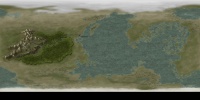
It is not obvious what "projection" you intended to be using for your map. In particular, whether or not your map goes all the way to the poles. When a map does include a planet's poles, people usually draw a map which is called "equirectangular", with degrees of longitude drawn the same size as degrees of latitude. Such a map winds up being twice as wide as it is tall. Here's what your map would look like in that case (overlayed with lines of latitude and longitude separated by 10 degrees).
tmp4.jpg
Maps which do not include the poles, are usually drawn using the "Mercator" projection.When using a Mercator projection, the lines of equal latitude are stretched apart more and more in the areas close to the poles. These maps often are used in primary and secondary schools when teaching children geography and history, since the Earth's poles have been relatively unimportant until recently. If your map is a Mercator projection, here's what it looks like with lines of longitude and latitude separated by 10 degrees:
tmp3.jpg
If you want to map a Mercator projection onto a sphere, though, you do need to include the polar areas. The equivalent equirectangular map would look like this:
tmp2g.jpg
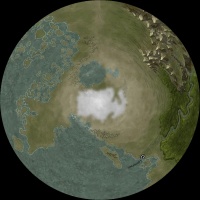
A problem with polar regions is that Mercator and equirectangular maps stretch them across the entire width of the map. As a result, hand-drawn features which look reasonable on a flat map get squeezed together when drawn on a sphere. They often look more like streaks pointing away from the pole. This is often called a "polar pinch". Here's what the south pole looks like using your map if you intended it to include the poles, with and without the long/lat grid:
capture_26112015_085645.pngcapture_26112015_084224.png
Finally, here's what the south pole looks like if your map is a Mercator projection, not including poles. The streaks are less pronounced, but we can't know what the geography might be like in the polar regions.
capture_26112015_084317.png
One way to get the polar features to look reasonable when mapped onto a sphere is to draw separate maps of them as if you were looking straight down at the poles and then to use a re-projection utility to merge those maps with a equirectangular map of the rest of the planet. Personally, I like to use MMPS project (a command-line program) to do the re-projection but there are many others.
Disclaimer:
In case it isn't obvious, I (and John, too, perhaps) like to use Celestia to build imaginary solar systems using maps drawn by members of the forum. As a result, being able to see the poles is relatively important. There are many other programs available for visualizing and traveling among planetary systems in 3D. Orbiter and Space Engine are two examples.
Selden
Fantastic work so far Obbehobbe, lovely mountain ranges, and the forest/jungle looks really great! Keep up the good work.
 Posting Permissions