Reply With Quote
Oh, no problem. I've thrown that question out there if, perhaps, someone has some good examples to recommend. I just started researching, I'm sure Ill stumble upon numerous good examples soon right here on this forumOriginally Posted by Mouse


I am sorry, mats. I've only been here just over 3 months myself, and I certainly don't have an encyclopaedia-like memory of where I've seen things.
Maybe one of the other members would be better placed to help on that front?


Oh, no problem. I've thrown that question out there if, perhaps, someone has some good examples to recommend. I just started researching, I'm sure Ill stumble upon numerous good examples soon right here on this forum


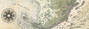
If it closes into a complete circle like that it's not conic, it's polar azimuthal. Since the features at the equator don't show any east-west stretching, it would have to be polar stereographic in particular. This really is not a projection that makes sense for a map of a narrow band of habitable land at the equator, it's a projection suited to a map of the pole. A world with a narrow equatorial habitable band would be ideal for cylindrical projections with standard parallels near the equator. For instance it would be one of the few places that Plate Carree would really be a good choice for a finished map. A conic projection would be a good choice for larger scale maps centred north or south of the equator, but it would be a very steep cone with the standard parallels near the equator and hence a very slight curvature to the parallels.
Wow. That's super technical, my head hurts. You sir, are extremely knowledgeable on this subject.
This is a great explanation/introduction of map projections. Thanks! I guess I'm going for polar stereographic
Truth to be told I was aware of of the distortion when I started (not that I gave it much thought but I understand the basics) but I wanted to draw it this way for artistic purposes - so I could also show the moon that's tidally locked to it and have that ring shape of the world. As I said, it's a testing mash of everything for me to learn how to draw nice maps
I did actually assume that people of this world would use cylindrical projection focusing only on equatorial habitable area and I'd draw more detailed maps this way...
Last edited by mats; 10-07-2016 at 06:12 AM.
Following Hai-Etlik's advice I focused on one small area of my map... I'm quite inspired with Caenwyr's thread so I picked few of his tricks (imitation is sincerest form of flattery)
M3.jpg
I've learned that I probably need to use higher resolution because auto-fill didn't want to work with me on this one (that's why the color goes over the lines in places). I'm also not happy with small hills and rivers (although I think rivers will automatically look better with higher resolution, no idea what to do with hills). For towns, roads, labels and other features I guess I should turn to Illustrator... I'm not sure, I'll have to read few more tutorials...
Same as before - this is me learning both photoshop and cartography - it's a phase before work-in-progress phase
So... following this tutorial http://www.fantasticmaps.com/2012/04...-draw-forests/ I made some progress with the colors and volume. I really like the watercolor-y effect on white background, that's exactly what I wanted to do with the ring shaped world that I mentioned. And I used a better suited resolution for this one so things are starting to look almost decent. Almost
M4.jpg
I'll obviously use this thread as some sort of learning blog and, hopefully, it will produce some kind of map in the end...
Nice, I particularly like the forests! I probably would do more strait and sharp lines for mountains.
Oh wow! That is such a huge improvement from one map to the next.
Keep them coming
Wow, that's some huge improvement !
 Posting Permissions