I love the colors! And the fact that you were able to draw that in a day? I tip my hat to you!

Ooh, pretty. Looking very nice Thomas, this is going to be a tough one to beat.
Cheers,
-Arsheesh
I love the colors! And the fact that you were able to draw that in a day? I tip my hat to you!
Like a thief in the night
she comes with no form
yet tranquility proceeds
the accursed storm...
check out my new Deviant Art page!
https://www.deviantart.com/ladiestorm
Oh! You've done one of those pretty oceans again!
You really must tell me how you paint that texture one day *big smile*
Are you going to shade the mountains?
Free parchments | Free seamless textures | Battle tiles / floor patterns | Room 1024 - textures for CC3 | GUILD CITY INDEX
No one is ever a failure until they give up trying
Thanks RobOriginally Posted by Redrobes

Thanks QED42
Thanks arsheesh but let's not be hasty, there are many pretty good entries.
Thanks Storm, that's the training, nothing beats practice
I am going to shade the mountains AND the terrain AND redo a pass at the forests. About the ocean, check your PM box
Looking fantastic, Thomas. Can't wait to see what it looks like with shading!
My first thought was: Seriously it only took you 2.5 hrs to draw! It took me that long to figure how to upload my island shape, lol.
Then you went and colored it and wow, its stunning. Really nice so far. I really need to get my practice on. Beautiful.
Thanks a lot Daniel and Kier
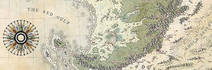
Juggling with three WIPs is a bit tough but they all go on. Here's a little update on the map. I've started shading the mountains but I prefer to show it once it's done.
### Latest WIP ###
inkpost3.jpg
As you can see, not much has been done, just hiding some parts of the black linework and reworking it in white or color. That doesn't look like much but I think it anchors the island better into the sea.
Looking good, the colors are terrific. The mountains are good but they need something to bring them up to the same level as the rest. Maybe some texture, maybe some shading, probably both.
My Battlemaps Gallery http://www.cartographersguild.com/al...p?albumid=3407
Thanks BogieI hope I'll have the time to add shading to them as well as the land itself. I plan on doing it but with two commissions running along this challenge, that's a bit tough, schedule wise.
I'm really loving the colors and shadings in this map, Thomas! May I make one suggestion, though, if you have the time to do it? The text, for me, is blending a little too much into your ocean, because the colors are so similar. Is there a way you can make your title stand out a little bit more?
Like a thief in the night
she comes with no form
yet tranquility proceeds
the accursed storm...
check out my new Deviant Art page!
https://www.deviantart.com/ladiestorm
 Posting Permissions