What do you think of these trees??? I've only done a little test patch so far, but was wondering what you guys think before I move on. Do you think I should go with this style or am I totally off the mark?
### Latest WIP ###
light challenge t.jpg

Thanks Mouse, thats sort of what I was thinking for the water too.
I got my inner coast and border highlights done today and started experimenting with some trees, I ended up having to darken the parchment a bit. As always the trees are giving me problems, Ill post an up date when I get at least a small clump of trees done and hopefully get some critique, Im trying to do Voolf style trees but its just not working out for me.
Looks like it will be another long night, the little ones dont let me get much done during the day.
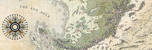
What do you think of these trees??? I've only done a little test patch so far, but was wondering what you guys think before I move on. Do you think I should go with this style or am I totally off the mark?
### Latest WIP ###
light challenge t.jpg
The mountains are great and the small patch of forest looks wonderful with them.
My Battlemaps Gallery http://www.cartographersguild.com/al...p?albumid=3407
Ooh, this is looking really good so far kacey. Mountains and forests look great.k
Cheers,
-Arsheesh
I think the trees look really great in (soft) contrast with the mountains.
Brilliant trees
Please can we have some more?
Free parchments | Free seamless textures | Battle tiles / floor patterns | Room 1024 - textures for CC3 | GUILD CITY INDEX
No one is ever a failure until they give up trying
It's a terrific map kacey ! If I may, I think the sea ripples need to be less computer generated and I'd add a little bit of variation to the title color (maybe with B&W on an overlay map), something discreet but it could do wonders. This aside, you're quietly heading to the top steps of the podium
Yup, this is already excellent, kacey!
Thanks every one, I feel better about moving on with the forests now. I’ve got the line work done for about half the map, hopefully get it finished up tonight so I can start shading them tommorow.
Thomas... I’ll go over those sea lines by hand once I decide on the water colour, but I’m going to leave it until the end just in case I run out of time on some other things. I’d like to do the title colour like in my Ehren map, darker on the edges and more faded in the centre I always like that look... Thanks for the advice I really appreciate the feed back.
No worries, it's gorgeous enough ax it isBTW I love how you did your coastal details highlights. Reminds me of a border from a previous challenge map of yours that I'm still studying to replicate the carved limestone vibe of it.
 Posting Permissions