Sorry, I'm not sure how I missed that.Originally Posted by vorropohaiah


Sorry, I'm not sure how I missed that.

Moved to the WIP forum per OP's request.
Gidde's just zis girl, you know?
My finished maps | My deviantART gallery
My tutorials: Textured forests in GIMP, Hand-Drawn Mapping for the Artistically Challenged
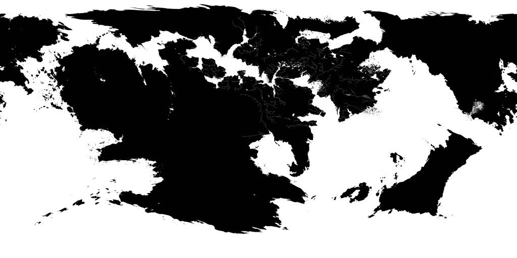
so I've gone back to the drawing board (well, my tablet, at least) and come up with a new equirectangular map of the world, trying hard to avoid pinching at the poles. this is what I've come up with (rivers only appear in regions that ive made a decent account of history/climate/geography):
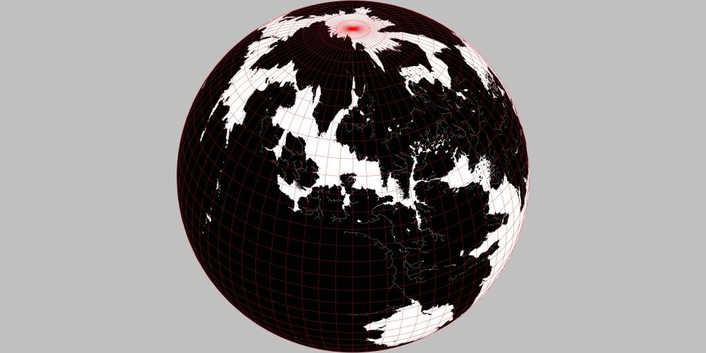
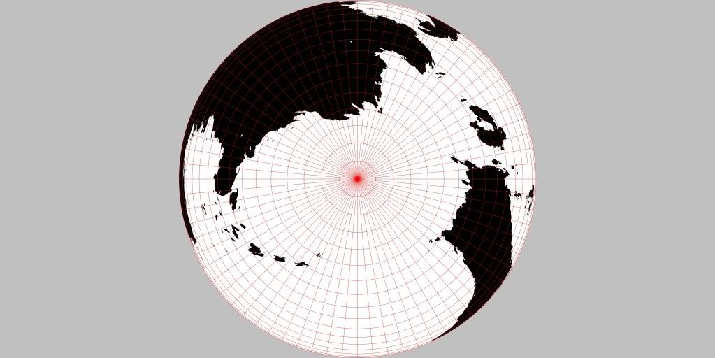
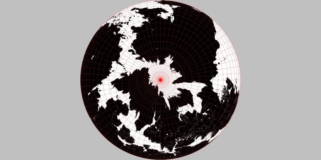
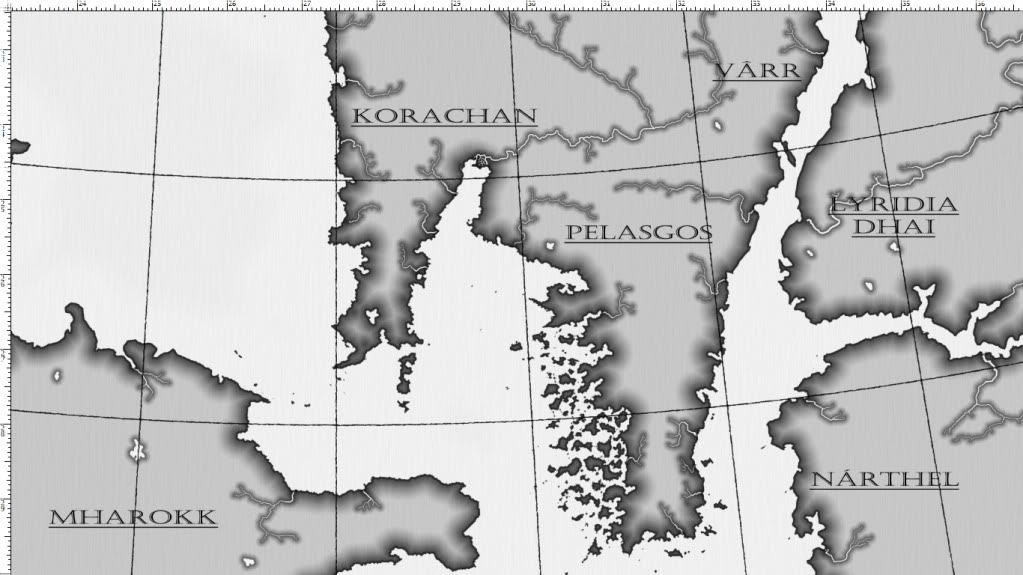
It's little different to the older version, though I've made the 'Inner Sea' area proportionately larger (not as easy as it finds) to better-fit in with current world-building attempts. I ran the map through the NISS software and came up with three vertical perspective maps (one each for the north/south poles and one centred on the 'Inner Sea'). the poles will form the base for a pair of matching maps I'd like to do, detailing the poles.
I also made an equidistant conical projection that became the base for a fresh map that I started work on this afternoon. So far I've only gone over the coastal areas and put them through a mask, with a gradient stroke to create some definition. I've also thought of 2 different borders - well actually just one but with 2 different chequer effects - the first has a cheque effect that is consistent with the graticule scale, with each box measuring 1 degree. the second is just decorative (though with each box 1" I can be used for scale purposes, once the scale marker has been added. Please let me know what you think!
I also changed the font for the nations, which is now a Castellar font, though I'll be using different ones for cities and towns, and features and formations, respectively. though i havent decided quite what yet...
any C&C is greatly appreciated, thanks
Last edited by vorropohaiah; 06-01-2012 at 02:35 PM.
That's looking pretty good!
Gidde's just zis girl, you know?
My finished maps | My deviantART gallery
My tutorials: Textured forests in GIMP, Hand-Drawn Mapping for the Artistically Challenged
Wow! Just wow. I totally dig this - i love the continent-shapes (i know, i said it already...but it needs repeating). Very much looking forward to the progress of this WIP.
I'm trapped in Darkness,
Still I reach out for the Stars
Looking quite impressive! I think my jaw just hit the floor. The landforms are very interesting and realistic.
"Listen, strange women lyin' in ponds distributin' swords is no basis for a system of government."
My Albums - My Portfolio
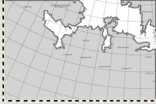
so i spent some more time today, finishing off the border (i went for the first choice if anyone was wondering :p) and continued with a bit of texturing, numbering the graticules, and adding the rivers and trying to figure out the nation borders with this new perspective.
Looking good! The only thing that's bothering me is the labels. They look stretched (although that could be the font) and they really ought to be curved/angled/something, imho. I'm also generally not a fan of underlines, but that could just be because I spend so much time on the web that underline==link in my brain, hardwired at this point.
Gidde's just zis girl, you know?
My finished maps | My deviantART gallery
My tutorials: Textured forests in GIMP, Hand-Drawn Mapping for the Artistically Challenged
Do you think they should be curved with the graticules or the terrain? I was planning on the former but thought the higher latitudes might be a bit too curved. I believe the font is stretched at 120% though that was just because I thought they looked better... Maybe not? The underline is because a bold font 'distorted' too much
I'd curve/angle them with the terrain. It ends up looking more natural.
Sent from my iPhone using Tapatalk
Gidde's just zis girl, you know?
My finished maps | My deviantART gallery
My tutorials: Textured forests in GIMP, Hand-Drawn Mapping for the Artistically Challenged

 Reply With Quote