Reply With Quote
Fantastic job... !
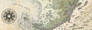
I might join previous comments about the labels on the mountains... hard to read from far (but OK on the zoomed map)

I agree with JB, making the forests ascend to the base of the mountains was a really nice touch. And, as always, really dig the style of those mountains.
RazielKilsenhoek has a point about the clarity of the fonts on the mountains and coastal cities. I agree that this problem might be side-stepped with the coastal cities by simply changing the color on the labels to a lighter hue. As for mountains, I've run into this same problem myself and am still casting about for a decent solution to it, so I'm afraid I don't have any recommendations for you there. Great work so far though.
Cheers,
-Arsheesh


Fantastic job... !
I might join previous comments about the labels on the mountains... hard to read from far (but OK on the zoomed map)
Originally Posted by arsheesh
 Thanks to both of you
I tried bettering the labels that were a bit hard to read but could not find a way to do it efficiently. Also, as Joel says, they're readable on the zoomed map and the soomed map appears on the screen at the same size the printed map will show so (at least on my laptop) that's cool plus I played a bit with the "real world" feel of the map and it changes some things.
I also drew a ribbon for hte title and wrote it in golden letters. I hope it works well. I'll just need to rework the borders between the kingdoms but I think the map is pretty much done so, say your piece or remain silent forever
Titled post.jpg
Looks amazing and I think it will come out beautifully in print. I really like that the water labels have white text with a dark outline, to contrast the land labels.
Speaking of the labels you asked for feedback on earlier, I was playing around in Photoshop a bit today (was supposed to be working but working from home is a slippery slope). I don't have the font you used so I couldn't copy it exactly, but I tried to replicate the mountain labels on your map, while using your map as the background. I also thought, like you, that it might be a color issue, so I fiddled around with that as well.
Two things I noticed that may or may not be useful to you: First, I made the outer glow on the mountain labels larger. Even when increasing them by 1 or 2 pixels, I noticed a difference. Second thing I tried, which I thought might work but you may disagree, is changing the color of the outer glow on the mountain labels to a more brown-toned white, even if it's a very light brown. Right now the outline clashes with both the background, and the text itself, where your forest labels (for example) are extremely easy on the eyes.
Just two final cents while I repeat that the map looks incredible. I really need to learn how to draw because these kinds of maps are so much more fantasy-inspiring than the computer generated things I make.


I love that title banner, but I feel like the color blends way too much with the land color - can you possibly darken it? That would probably make the gold lettering pop more too.
Whatever you did, I like those rivers better now
Thanks for pursuing your (our, I should say) quest for legibility
Thanks for this advice D. That worked wonders ! About the ribbon, I find it pretty relaxing to work on these parts of maps ... to be really honest, I sometimes doodle parchment borders to ease my mind
I followed your precious advice mateI, too, like that banner, I'll reuse it for sure
OK ! I've reworked the features mentioned above, reworked the country borders, added a scale and darkened a bit the fold/tarnished effect and I think I am done. It'll depend on the opinion of the client but I'm satisfied with the map or at least satisfied enough to say it might be one of my best map so far. Do not hesitate to give your opinion on any part, it's always appreciated.
Titled 2 post.jpg
The one tiny thing that caught my eye doesn't catch my eye anymore, so I think the color you picked works better. But my previous nit-picking aside, you really knocked it out of the park. I hope your client likes it, but I don't see why they wouldn't.
Thanks RazielKilsenhoek
Big thanks to everyone who lend a hand here
 Posting Permissions