Page 4 of 8 FirstFirst 12345678 LastLast
Results 31 to 40 of 75

Thread: Feb / Mar '18 Light Challenge: Telvehr

  1. #31
    Guild Expert
    Join Date
    Jan 2016
    Location
    Canada
    Posts
    1,499

    Default

    Quote Originally Posted by ThomasR View Post
    No worries, it's gorgeous enough ax it is BTW I love how you did your coastal details highlights. Reminds me of a border from a previous challenge map of yours that I'm still studying to replicate the carved limestone vibe of it.
    Thanks Thomas, I don't imagine it's much different then the way you do you're torn edges just a different shape, the stone border was surprisingly simple to do just takes a massive amount of time and repetition is all, and I'm sure you're perfectly capable of creating the same effect but much nicer then me. I did use the same technique for the coast as I did with that border, it's really no different which is why it probably reminds you of that.

    It's funny though, I was originally inspired by you, Voolf, and J.Edward and the way you guy's do the paper borders, and coastal effects. I was actually trying replicate that effect but it kept looking like stone so I said f it and did stone instead.

  2. #32
    Guild Expert
    Join Date
    Jan 2016
    Location
    Canada
    Posts
    1,499

    Default

    Is this too many trees??? I haven't shaded them yet just blocked in the main colour so they'll look drastically different once I do that, but after getting the initial colour blocked in I feel like it's just way too much and I'm having a hell of a time getting the little bumps all the same size. I'll do a patch of trees then zoom out and almost every time the size is totally wrong so I have to do it over and over again, it's really frustrating, and it's a real pain because once you get them nestled into the mountains you can't just resize them because then they don't fit any more so it's pretty inconsistent. I've never done this style of trees before so I imagine I just need to practice more until I get the hang of it, they definitely won't be perfect this time around.

    I added some color to the water as well but I need to go in and fade it out in some spots and darken it in others if I get time so it still needs allot of work, and the city icons are definitely inspired by Abu.

    ### Latest WIP ###

    light challenge.jpg

  3. #33
    Guild Grand Master Azélor's Avatar
    Join Date
    Jul 2008
    Location
    Québec
    Posts
    3,363

    Default

    You are pretty hard with yourself. The trees looks pretty good. It's probably better if there is randomness in the size. It look more natural and it takes a lot less time to do.

  4. #34
    Guild Adept Tonquani's Avatar
    Join Date
    Nov 2017
    Location
    Cumbria, UK
    Posts
    400

    Default

    Quote Originally Posted by kacey View Post
    I'm having a hell of a time getting the little bumps all the same size. I'll do a patch of trees then zoom out and almost every time the size is totally wrong so I have to do it over and over again, it's really frustrating, and it's a real pain because once you get them nestled into the mountains you can't just resize them because then they don't fit any more so it's pretty inconsistent.
    I think the trees are excellent! As for getting them the same size, what I've found helps is if you lay a grid over them when drawing, so that you have a visual reference that will stay the same despite how much you zoom in and out.

  5. #35
    Professional Artist ThomasR's Avatar
    Join Date
    Nov 2015
    Location
    Angers, France
    Posts
    4,154

    Default

    I'd say the tree's bumps are good to me, different sizes help sell the natural part of it. Do you plan on adding shades and highlights to the canopy ? Trunks or cast shadow to anchor your forests ?

  6. #36
    Guild Expert
    Join Date
    Jan 2016
    Location
    Canada
    Posts
    1,499

    Default

    Quote Originally Posted by Azélor View Post
    You are pretty hard with yourself. The trees looks pretty good. It's probably better if there is randomness in the size. It look more natural and it takes a lot less time to do.
    Thanks Azelor, I wasn’t sure if the size difference was too noticeable but I will leave them as they are, I’m running out of time to get this done by the dead line.

    Quote Originally Posted by Tonquani View Post
    I think the trees are excellent! As for getting them the same size, what I've found helps is if you lay a grid over them when drawing, so that you have a visual reference that will stay the same despite how much you zoom in and out.
    This is a great idea, thank you so much, I’ll put this in my toolbox for next time.

    Quote Originally Posted by ThomasR View Post
    I'd say the tree's bumps are good to me, different sizes help sell the natural part of it. Do you plan on adding shades and highlights to the canopy ? Trunks or cast shadow to anchor your forests ?
    I’ll definitely be adding shadows and highlights to the canopy, and a slight shadow underneath, nothing too drastic for the drop shadow I’ll probably keep it subtle and warm but I won’t be adding trunks, that’s just not a look I’m very fond of.

    I’m just sitting down to start the shading right now while my daughter is napping, I think I’ll start with the mountains today and then move on to the trees once the mountains are done. I’m doing two shadow and highlight passes on the mountains and the trees, one soft and subtle and one a bit more sketchy to tie in the other elements...

    Wish me luck, this next stage is going to take a long time. I’m hoping to get time to do some grass and terrain details but I doubt it will happen as I have a really busy week next week. I’ll be lucky to make it to the labeling faze so it may all be for not.

  7. #37
    Guild Apprentice
    Join Date
    Feb 2018
    Posts
    36

    Default

    This is such a cool map. Love the colors, mountains, and trees. I'm learning a bunch from this WIP.

    The city markers kind of bug me as they don't match the perspective of the rest of the map. But that's a minor point. It's a great map.

  8. #38
    Guild Journeyer elboe's Avatar
    Join Date
    Dec 2017
    Location
    Iowa, USA
    Posts
    153

    Default

    I think the trees look great, as well as the rest of the map. They fit the style and I don't think you have too many at all. They aren't crowded or to thin. I like your idea for the shading as well. Good Luck!

  9. #39
    Guild Expert
    Join Date
    Jan 2016
    Location
    Canada
    Posts
    1,499

    Default

    Thanks Kenan and elboe, I got the first pass of Mountain shading done, it took about 5 hours which is a record for me. I've put about 12 hours into them so far but I think I can get the second pass done in another 3... Why do I do this to myself, ugh. I also fussed around with the texture background and tried to hint at some terrain detail because I'm sure I wont have time to draw tiny tuffs of grass, and slightly darkened the coastal edges... The trees are still looking pretty flat, I'm procrastinating on them a bit, I've never shaded this type of tree before so I'm bracing for some head aches while I learn new techniques.

    ### Latest WIP ###

    light challenge.jpg

  10. #40
    Guild Expert Abu Lafia's Avatar
    Join Date
    Feb 2015
    Location
    Germany
    Posts
    1,256

    Default

    What a beautiful map Kacey! The amount of work you put into this piece is really paying off. Your wonderfully detailed yet subtle linework/hatching and shading makes it look so elegant and light-hearted, even if the process seems to be a pain in the a$$ 
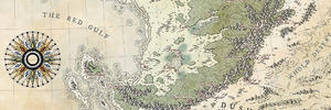
The trees/forests fit the style perfectly in my view and there's really no need to struggle too much with them. I have my problems with shading forests regularly and i'd say less is more in this case ... In a subtle environment, those beautiful mountain ranges will shine even more! Well that's just my two cents. Btw. the darkening of the coast and the coastal waters worked wonders on the whole appearance of the map.
    Keep up your fantastic work. It's always a joy to look at!
    Map is not territory...
    Current work in progress:Korobrom | My finished maps
    My DeviantArt site and Twitter

Page 4 of 8 FirstFirst 12345678 LastLast

Posting Permissions

  • You may not post new threads
  • You may not post replies
  • You may not post attachments
  • You may not edit your posts
  •