...riiiiiiight.Originally Posted by GLS


...riiiiiiight.
Definitely blue and sepia. It's lighter on the eyes. I have to say looking at it reminded me of this very famous map (I think someone used it as a model recently, here at the guild, but I can't recall who or when). Although, actually, looking at it again... it isn't a "caterpillar" map and the color scheme isn't at all similar.
Still, a quick note for thought. I think "caterpillar maps" are prior to the age of color prints.
Having said this, your green/gold version was just about right colorful and a pleasure to look at.
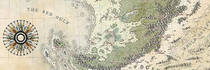
Oh my god, that map is beautiful. And so high res *drool*. I'm still a newb around here, so I don't know all the map sites yet... thanks for posting that!
PS Am I just missing something, or where is the insert located in the larger map?
I can't pick one or the other... both are very nice. I like someone else's idea of utilizing each one to show different info.
Agreed ! Thanks for this suggestion, i'm trying to implement all this elements in the two maps.
Thanks GLS. I modify the blue tone of the coast with a darker one. I find it more efficient. Thanks for the help.
Thanks Pixie. My inspiration comes from maps in the Rumsay's collection, here.
Thanks nothingbutblue. New Atlantis is now located.
Find some spare time to continue on this and here is the new update with the major labeling.
To be made :
-road, railroad, steam road.
-border of the states.
Comments and advice welcomes !
Oh my god, dude. That is just blowing my mind.
Eeeeeeee!
It's all so legit and tactile feeling.. gah. Loving that non-photo blue color. <3 <3
Gorgeous work, Warlin! It's looking amazing.
"We are the music makers, and we are the dreamers of dreams"
I love everything about this map Warlin!
https://www.cartographersguild.com/a...p?albumid=4718
My CC3+ Symbols https://cartographersguild.com/album.php?albumid=5194
My deviantart profile: https://crawfordcartography.deviantart.com/
I thought I commented on this map but it seems I messed up. I really love what you did Warlin. I had a great preference for the colored version event if I'd have toned it down a bit. This last version is really great. I'd totally see this printed on high quality paper with relief. I've seen a map of the florida's keys in this simple style with embossed printing and it was wonderful. Your map deserves such a treatment.
Thanks all. Glad it please you and hopes the new additions won't hurt you
I don't let the colored version down, Thomrey. I'll hope i can complete it next year.
Here is the update with the states territories. I have some trouble to decide me.
Cheers.
 ).
).

 Reply With Quote