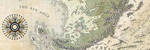
Superb map! There's a fabulous amount of detail in there. Those mountains must have taken ages to draw.
Solid contribution to the Guild World!


You're right Mouse ! I'll correct that... I wanted the frame to blend more with the paper, but to smooth the border of the border is not the right solution... I'll probably work on the opacity of the black lines.Originally Posted by Mouse

And thanks for your kind words !
Thanks a lot ! I hope to finish it this weekend !
You are right for those labels : I'll try to reinforce the glow around some of them to ease the reading. The point was to avoid placing those labels on the see : if this map joins the guildworld one day, everything that's on the sea will be cut off.
And yes, I googled "viking compass"... and found that you had done the same... But I thought that after all, it makes sense that two similar countries use the same compass... I'll try to add rhumblines this weekend, but I'm not sure the result will be good... I'll see that
Thanks a lot ! I sure took my time for those mountains, but it's a style I wanted to try for a long time... Diamond used carterpillar too in one of his latest map, and I think it gives a style, or an "age" to the map which is really interesting because once you use this kind of relief, it gives you some directions for the rest of the map (forest, rivers, labels... even border). It's a constraint and it might be challenging.
It's OK. Mine is actually different. I took the viking compass as a refference and made my own, though simillar at first look.
New Horizons
Fantasy maps and illustrations.
All my non-commisioned maps are FREE for personal use. Get them at my home page New Horizons
Get more of my maps by becoming my Patreon.
Support:
Patreon | Tip via PayPal.Me | Buy Me a Coffee
Wow, I missed like 2-3 pages of development here. It's gorgeous work, Jo!
Hello !
Some corrections fellowing your comments, some changes for the labels (less colors) and a story for the place... Here's the last WIP
Northern Maze 08.jpg
Hello !
Again a few corrections and additions: snow at the top of mountains, rhumblines, some labels ...
Unless you find any corrections to make or you have ideas for improvements, I think this map is finished?
Northern Maze 09.jpg
(All my apologizes to Kelleri and other Finnish people for the misuse of your beautiful language)
Thank you for your critics and comments!


This is really beautiful and well done, love the mountains and depth that you've made with the rising planes/plateaus, great job!!! My only comment would be the text is a little tightly kerned (letter spacing) Menetetty gets really blocking looking. I'd love to see more in this style from you. Really love "Maa" rising mountain, looks volcanic to a degree.
I will... very soon, with a PNG version for the big map !
Thanks Thomas, it fellowed the "exercises" I did with the bookmarks
Thanks for your kind words, and you're right about the wrong word... I'll change that tonight
Kacey might just be on vacation ? the map was really starting well !
Thanks ! You're right about the text being kerned... I did it because I didn't want any label out of the coast line (except for those describing part of the sea), because thoses labels would have been cut off for the Guild World map...
Here's the PNG version for the big map :
Northern Maze For Guild World.png
Here's the last WIP :
### Latest WIP ###
Northern Maze 10.jpg
Last edited by - JO -; 08-06-2017 at 09:12 AM.
Perfect
Are you going to put it in finished maps?
(if you have already, I apologise for missing it)
Free parchments | Free seamless textures | Battle tiles / floor patterns | Room 1024 - textures for CC3 | GUILD CITY INDEX
No one is ever a failure until they give up trying
Nice atlas style !
 Posting Permissions


 Reply With Quote