Reply With Quote
I did it on this map, post #27. I avoided the artefact by drawing in black on the layer mask of the ocean. You can see the result.


Hey Josiah, thanks for your enthousiasm! I'm a big perfectionist when it comes to these things, and basically, on a map with north being up, sunlight should never come from the top when depicting the northern hemisphere north of the Tropic of Cancer, simply because that part of the world never sees the sun in the north. So if I want this place to be in the northern hemisphere and want the sunlight to come from a realistic angle, I either have to reshade everything or rotate the map.Originally Posted by Josiah VE

Now what I could do is swap the blending modes of the hand-drawn on-object shadows so the light seems to come from the south west - which is a perfectly possible angle. The same isn't possible for the hand-drawn drop shadows however - but at this stage these have been generated mostly automatically, with no major adaptations to them at this point. So I could just change the angle of the light in settings and be done with it.
However, if I want to use this map for the city of Faltorn in my novel (you can find that city on the eastern shore of the Dragon's Tail in this map) as I stated a while back, I will have to rotate it 90° clockwise anyway, since the river in Faltorn flows south to north, not east to west. As a big plus, rotating the map would work out perfectly with regards to the sun angle as well: light would then come from the South East, which is just as plausible as the former correction scenario.
I haven't, but I might experiment with that idea for a bit. Would make it look mare natural maybe. I'm not sure if the transition from water to land is that clean though: if I remember correctly I used the coastline layer to select the water area. I tried to be as careful as possible, because I know bad things can happen when you use a line with a certain thickness to delineate areas on both sides of it, but I can't guarantee there won't be at least a few selection artefacts hidden under that line. Each no bigger than a few pixels, but together they might spell visual disaster. Or they might not. I'll have to check out!
If it turns out too messy, I can still tune down the opacity of the coastline layer a bit, or render it a brownish grey instead of that harsh black. Possibilities possibilities!
Last edited by Caenwyr; 09-15-2016 at 11:25 AM.
Caenwyr Cartography
Check out my portfolio!
I did it on this map, post #27. I avoided the artefact by drawing in black on the layer mask of the ocean. You can see the result.


Your linework is superb, really nice job. Love the colors, especially the green field areas. The cliff lines seem a little short, maybe one or two continue a little further? Looking foward to seeing this progress.
Well Thomrey, it does look good on your map! Didn't manage to get it right on mine, so my coastline layer is staying, albeit slightly lighter (added a sandy-coloured clipping mask at a ridiculously low opacity).
Thanks for your feedback Snodsy! will keep your remark regarding the cliff lines (or squigglies, as I like to call them) in mind for my future maps! I'm glad you like the map!
Also, I managed to get a decent amount of work done yesterday evening:
- Finished the on-object shading, and
- managed to do the drop shading in record time.
- Also drew in the terrain shading with a mask so it doesn't overlap with the buildings
- Apart from al this shady business (hee hee) I tweaked some colour layers a bit to make the contrast between sea and land less harsh - plus the vibrant blues in the sea just too too much attention away from the city itself. I hope I managed to fix that.
And that's about it! If you guys don't have any remarks anymore (if you do, don't hesitate and spit them out!), I think I'm gonna call this one finished - at least for the map part. Legend, title etc etc etc will be done in the next update.
Sagitarii10.jpg
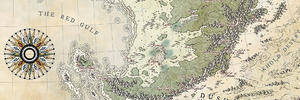
Bonus fact: since I've been working on this map for so long, rotating it just makes it look weird. So I'm not gonna flip the shading around as I talked about in my previous post, neither am I gonna rotate it. A compass saying up is east should do the trick marvelously, plus it will lend the map some authenticity. After all, maps always used to have east side up before cartographers got some sense knocked into them. I'm just gonna act like I'm one of those pre-sense doofuses.
Let me know what you think!
Last edited by Caenwyr; 09-16-2016 at 09:35 AM.
Caenwyr Cartography
Check out my portfolio!
Beautiful! It really has a lot more depth now.
My only comment would be that the forest it looks a little flat at the moment.
I agree with Snodsy about the cliffs.
I suppose this town isn't expecting a land invasion? All the walls are facing the water.
Great job, I love this map.
Well whadayaknow, you're right of course! Hadn't paid them the attention they deserved up til now. How about this then?
Sagitarii11.jpg
Caenwyr Cartography
Check out my portfolio!
Wonderful ! I'm always amazed at how shading brings maps to life !
This is looking fab!
"We are the music makers, and we are the dreamers of dreams"
Excellent map ! Beautiful city !
I love all the stories that your map is telling !
The bridges, the city fortress, the circus and the theatre, the habours...
All of your drawing that makes me want to visit the city !
Good job !
 Posting Permissions