Reply With Quote
Great progress on this Ilanthar. Hope you find the time and the patreon to finish all your RPG stuff relating to this world, or another...


Hope I'm not chiming in too late about the type.
"Trarat of..... Taryil. ---- The "TA" and "TR" should have a little negative kerning (tracking) to sit under the overhang of the "T".
Land of the Ishadirs --- maybe too much leading (space between lines), I'd be consistent across the board on these.
I think sometimes it's better to not put type on an angle, I like the type on an arc better or straight, but that's just my opinion.
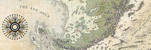
Seems like there are two sizes - are these all areas? I'm a little confused as to why they are different sizes.
Do the stars represent City Capitals - but aren't labeled?, somewhat confusing.
The maps is absolutely beautiful.
Great progress on this Ilanthar. Hope you find the time and the patreon to finish all your RPG stuff relating to this world, or another
Ahah
I tried something completely different : new fonts, almost no curvy labels and I put some capital names in Lond.
Some labels are still probably misplaced... I think it's better, but any comment/critic is very welcome.
@Warlin : Thanks! I'm working a lot more on this year end... but I'm certainly not giving up. The miracle would be that I actually focus on just ONE thing.
Ersïa.jpg
Much cleaner looking, I like it better, but I'd probably lean more toward an antique serif font and not a sans serif (too modern looking)
Roman Antique http://www.dafont.com/roman-antique.font
Caslon Antique
Garamond
Inknut Antiqua https://www.fontsquirrel.com/fonts/inknut-antiqua ---- this one has a few faces too.
Hultog http://www.1001fonts.com/hultog-font.html ---- I used it on my New England Harbor and Death Comes Calling, (I think?)
I have a couple other free fonts that I use, which I'll look over tonight and send if you'd like. Sorry cann't remember the names
First, I really like the coloring. Second, even if the labels are more legible, the typrewriter font takes away the charm of the earlier labeling in my opinion.
Well, this world is quite "modern" in a lot of aspects. The technology is different of ours and it's not as advanced as we are, but it's definitely not an heroic fantasy setting. Think "Dishonored", "Bioshock" or "Golden Compass", even if it's not really close of those.
That being said, you have both good points! So, I tried something with another font (Cabbage Town SC Std). Better?
Ersïa.jpg
@Snodsy : I've tested your suggested fonts and some are really excellent! But I have to use them at a very small size, and that makes it difficult. Thanks a lot for the resources, anyway.

Good lord this is beautiful work! How are you doing the terrain relief? What's your technique?
Thanks Krummja . I'm using existing shaded relief of Earth/Mars and kinda "paint" with those.
A bit more to give you a better view of the new font test.
Ersïa.jpg
I'm a big fan of this map, you're land forms are awesome, I love the colour pallet, and I'm envious of the way you've handled the relief, but I'm unsure about the font on the bigger labels. In the water it kind of works except for the sea of sirens, and in, and around that area where the sea labels are on an angle, I think those ones would look more polished if they were slightly curved, right now to me they look out of place. Also the bigger labels on the land, I just think they need something more, I'm not really sure what it is, maybe it's because they're sort of transparent, but they just don't look right to me. That being said I don't mind the font on the smaller labels they look alright. Sorry to be so critical, I hope I don't offend you, I just feel like a map as beautiful as this one deserves an equally beautiful font to tie it all together.
The map's looking gorgeous. This style isn't normally especially appealing to me, but I really like this one. I think I have to agree with kacey about the labelling, though. I'm not completely sold on the larger type (though the smaller labels look fine to me). I don't feel the letters stand out enough and they aren't completely clear, for example, I had to peer to see if it was 'Golant' or 'Colant'.
Also, I know this isn't exactly related to the map, but I absolutely adore how you've done your signature at the bottom left, where it looks like the little salamander is crawling over the page. 10 out of 10 for that!!
"We are the music makers, and we are the dreamers of dreams"