Page 7 of 10 FirstFirst ... 345678910 LastLast
Results 61 to 70 of 92

Thread: Ersïa

  1. #61

    Default

    Thanks a lot for your comments!

    I've changed the sea labels and hope it's better. I've done some effect on the continent labels but I'm not sure it's enough. The small difference between Golant and Colant come from the font itself, clearly...
    I'm also not sure of the polar ice.
    Anyway, your critics and comments are always more than welcome, don't bother about it Kacey !
    ChickPea : I'm very glad you like my new signature !
    Ersïa.jpg

  2. #62
    Guild Expert
    Join Date
    Jan 2016
    Location
    Canada
    Posts
    1,499

    Default

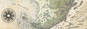
    The ocean labels look much better this way, big improvement! I actually like this font now, tho I really think you need to make the big land labels solid as well, that outlined text simply isn’t working, and I think you’d be hard pressed to make it work.

    I really feel like the big land labels need to be spaced out, so that they span across more of the land they are suppose to represent. If it were me I would put as much space between those letters as I could without of course going over board.

    I’ve struggled with labelling over shaded relief before, I find it’s quite difficult to get the text to not appear as tho it’s floating on top, or getting lost between all the texture. I think this type of map really needs a little something extra with the labelling to get it to stand out against the busy terrain.

    I think it’s entirely possible to get those big land labels to be a stand out part of this map, something that adds to the overall appearance of the map rather then taking away from it. Just look at Diamonds shaded relief style maps, he always manages to get the bigger labels to stand out, and sometimes has even used embossing to really make them pop.

    I used an inner bevel on my Varenthia labels, then I rasterized the layer style, and also put in an outer bevel to make it seem like it was carved into the land only because any other plain font seemed to float above, or get lost in the relief, and it was a real struggle to find something that worked.

    If nothing else, then I think you should at least make the big land font solid like you’ve done with the sea, maybe play around with some different colours, and definitely put some space between the letters...Sorry to be blunt but the bigger land labels kill this map for me, other then that it’s absolutely stunning, one of the nicer maps on the forum.

    And I’m with ChickPea on you’re signature, I’ve been admiring you’re little lizard it’s really neat.

  3. #63

    Default

    Thanks for the detailed comment, Kacey !
    And thanks for the praise.

    So, I tried to improve the continental labels. I used the same font I used for the countries and spaced the letters. Hope it's better.
    Ersïa.jpg

  4. #64
    Guild Expert snodsy's Avatar
    Join Date
    Sep 2014
    Location
    Cincinnati/Northern Kentucky Area
    Posts
    1,331

    Default

    Only comment on labels I'd make is that the leading (space between lines) seems a little too much. But again I know you've played enough with these labels already

  5. #65
    Professional Artist ThomasR's Avatar
    Join Date
    Nov 2015
    Location
    Angers, France
    Posts
    4,153

    Default

    Nice to see it fully colored !

  6. #66

    Default 2537

    Hi All-

    Long time lurker, 1st time poster here, so hello all, especially Ilanthar.

    I've been starting some worldbuilding lately. Since I work in CG, I created a file in Maya of a sphere w/ custom UVs for map images with a (preferably) 2:1 size ratio. This will allow me to project my maps (eventually...) onto the sphere in a way that minimizes distortion, at least in areas in that image that I would use for continents.

    Since this Ersïa thread is current, I like the map A LOT (nice work, Ilanthar!), and it happens to have a 2:1 ratio, I tossed the image onto the sphere in Maya to see how it generally looked and how much stretching there is. I'm pretty happy with the results of the sphere so far, although I'll be tweaking in the future. Just for the heck of it, I took a quick render, pulled it into Photoshop, put it over an image of space, and added a couple quick tweaks.

    There are a couple of areas on the map that get snipped out, but you can't see them in this image since I was able to rotate just enough to hide them.

    Ilanthar, I hope you don't mind me doing this or feel that I'm stepping on your toes. This was a fairly quick bit of work for me, so I just thought I'd share what your world might (roughly!) look like from space.
    Attached Images Attached Images

  7. #67
    Administrator ChickPea's Avatar
    Join Date
    Jan 2015
    Location
    Sunny Scotland
    Posts
    6,884

    Default

    That is so cool!
    "We are the music makers, and we are the dreamers of dreams"

  8. #68
    Guild Journeyer Tiluchi's Avatar
    Join Date
    Sep 2016
    Location
    Davao, Philippines
    Posts
    190

    Default

    Vardelm, that rendering is beautiful! I now have this idea of a mystery guildmember who pops up in random threads and turns people's maps into planets :-)

    Ilanthar, this is wonderful progress as always. I think the continent labels are much more readable now- I don't know if it's even necessary to make them solid at this point. The only very minor critique I have is that it's a bit hard to read them when they overlap with other text- Djibran and especially Elits being the worst offenders here. Perhaps they could be moved a little?

    Also, when viewed at 100%, your coastlines are juuuuuuuust a little bit pixellated, as if they're at a different resolution from the texture you used as your background. It's not a huge deal, but just enough to be a little distracting. It looks fine if I zoom out maybe 10% or so.

  9. #69

    Default

    Thanks guys !

    By Vardelm
    and it happens to have a 2:1 ratio
    Yup, it's completely intentionnal . As I stated before, I intend to put a small globe under the map to show the axial inclination of Ersïa.
    Something like this (I will remove most of the labels), with a use of an ortographic projection. I will probably just use one though.
    Ersïa globes.jpg
    Anyway, thanks for your comment Vardelm, and that is a really nice render! Thanks for showing it. Btw, there's a nebula visible half of the year in the night sky of Ersïa, and one moon. I fear I won't have the space to put informations about it, but well, just for you to know.

    @Snodsy & Tiluchi : I'm going to give it a try with reduced space between the letters then. And I'll try to make Djibran and Elits more legible. I fully agree about this last one, it's a hard one to place.
    About the coastline... maybe a jpeg artifact, maybe not. Anyway, I won't change the way I did it now. The maps is bigger than necessary just for solve this kind of thing and I'm confident it will disappear if printed.

    Still adding labels and working on the flags right now...

  10. #70

    Default

    Quote Originally Posted by Tiluchi View Post
    Vardelm, that rendering is beautiful!
    Quote Originally Posted by Ilanthar View Post
    Anyway, thanks for your comment Vardelm, and that is a really nice render! Thanks for showing it.
    Glad you guys like it. 99.9999% of the artistry in that render is the map itself. My portion was almost entirely technical. It was a good test for my sphere's custom projection.


    Quote Originally Posted by Ilanthar View Post
    Yup, it's completely intentionnal . As I stated before, I intend to put a small globe under the map to show the axial inclination of Ersïa.

    Something like this (I will remove most of the labels), with a use of an ortographic projection. I will probably just use one though.
    Ah, I didn't notice or remember that, but going back I see you had different projections and are using G Projector, so that makes sense.

    I actually think simple orthographic projections work pretty well. IMO the only time you really HAVE to worry about true projections is when you want to render a world as a planet, especially if you animate it.

Page 7 of 10 FirstFirst ... 345678910 LastLast

Tags for this Thread

Posting Permissions

  • You may not post new threads
  • You may not post replies
  • You may not post attachments
  • You may not edit your posts
  •