Reply With Quote
This looks great Daniel! I love the border details, and everything else, you really did a good job with the style here.

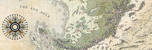
Here's a map that I have been working on for a while now. I'm making this map to thank three people who have helped me greatly over the past year and really helped me to start my business as a cartographer. Now you can understand that I want this map to be as good as I can possibly get it, but for some reason it just feel, I don't know, just not good enough I guess. There are still some things that I need to finish, such as the top corners, a decent title for the map, redo the compasses, because they look kinda blurry and just small things all around.
So I thought I'd share the map here and ask for your feedback.
Gratias Ago.jpg
As always, let me know what you think!
-Dan
This looks great Daniel! I love the border details, and everything else, you really did a good job with the style here.
Oooh, this is my favourite kind of map! It's looking fab, Daniel. Really nice work.
"We are the music makers, and we are the dreamers of dreams"
Man, you never cease to amaze me with the way you nail the "authentic" flair of old maps! Even the sloppiness in colouring, one can see so often on this kind of old maps, is spot on, i love itI'm not an expert, so i can't give you any hints how to improve it (actually it's hard to imagine for me to make it even better
) but i'll keep an eye on this thread.
Map is not territory...
Current work in progress:Korobrom | My finished maps
My DeviantArt site and Twitter
Its already looking so good its difficult to say anything that would improve it.
Lovely map!
Free parchments | Free seamless textures | Battle tiles / floor patterns | Room 1024 - textures for CC3 | GUILD CITY INDEX
No one is ever a failure until they give up trying
Well, it's indeed looking great already... Some labels are a difficult to read, but I guess you're not at full resolution. Not much more to say.
Splendid map ! Those angels are... ambiguous
I think I've seen some maps similar to this these last few month but I cannot remember where ... odd isn't it ?
This is a fantastic tribute to the maps of old, Daniel. You really nailed the style. I guess if you wanted to get a more faithful feeling you could try drawing with a different brush, less smooth. The color that Abu Lafia noticed are uneven and that's a good think for authenticity but they look like they've been laid with markers not pencil. Maybe look at old maps (again) for reference and try to duplicate the effect of ink or paint going through the parchment/paper. Maybe use a setting for your brush. In french it's Bords Humides which would translate as Wet Edges.
I guess you could also replace the darker parts by actual parallel strokes which would be fantastic but excruciating.
Your map is fantastic and these suggestions are only very nosy nitpicks and just because you asked
EDIT : And I love your Ortelius icons !


Your map is incredible! Since you're specifically looking for nitpicks, I would say the polar inset maps would look more consistent if they were a bit more generalized. Right now the level of fine detail, showing every curve and bump that's on the bigger hemispheric maps, seems inconsistent.
Thanks for the comment everyone!
I liked it so much that I just couldn't stop!Originally Posted by thomrey

Thanks for the suggestions! What did you mean with the darker parts and parallel stroked? The 'coastal waves'?
 Posting Permissions