Reply With Quote
I love those mountains! Very noticeable but able to blend in with the general scheme, kudos! The roughly random bordering when beach meets ocean is also a really nice touch. Great work!

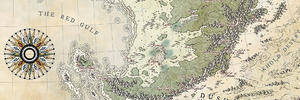
Here is another pen/watercolour attempt with the classic mountainous island.
Tamoclet.png
With the mountains and forests i started of with too many pigments, so i couldn't shade them as i planned... I'm generally happy with the mountain shades, but next time i'll try to start with a lighter basecolour and add darker shades layer by layer.
If someone has any tips how to create a more continuous (less patchy) sea i'd be happy to hear about.
Cheers,
AL
Map is not territory...
Current work in progress:Korobrom | My finished maps
My DeviantArt site and Twitter
I love those mountains! Very noticeable but able to blend in with the general scheme, kudos! The roughly random bordering when beach meets ocean is also a really nice touch. Great work!
Aah, love the colors here, and your mountains are amazing, Abu !
Just... I wonder if there is not a small perspective trouble, as if the coastline sounds like top view but mountains side view, if it makes sense ?
I maybe have some tips for you, but it's difficult to say in English as painting vocabulary is very specific... :
For the sea, if you use a good watercolor paper you should try to moisten the paper first and apply the color when it's still humid/wet. It needs some practice to success (and depends on temperature, etc...), but that's the joy of watercolors ^^'
Generally speaking, if you use slightly more water, you should be able to make smoother junctions as your paint will not dry that quickly. Using two brushes could help too : a big one with water for applying large flat color, and a smaller and dry one you can use to "push" the color along the borders or to make lovely gradients : needs to work quickly, but I saw some watercolorists using both brushes in the same hand
There's a bit of a surge in traditional watercolour maps around here, lately, isn't there? It's great, because the effect always looks so good - and yours doesn't disappoint, Abu! Very nice jobI really like the mountains here, and the whole thing (especially the thumbnail) is reminiscent of the beautiful traditional paintings of East Asia.
The only nitpick I have is about the land on the other side of the mountains (near Serk): it just seems rather empty. For future, I also think it would look good if the mountains poked above that coastline sometimes.
Wingshaw
Formerly TheHoarseWhisperer
Really nice work Abu
Artstation - | - Buy Me a Kofi
Another nice one Abu! You've been very busy
Oh that's lovely!
Also as for getting a more even wash for your ocean I second MistyBee's recommendation.
Whenever you want really smooth gradients or smooth consistent colour wash with watercolour always put down a layer of clean water first over the entire area you want to be smooth and apply the paint directly onto the wet paper (commonly referred to as the wet-on-wet technique)
If you want a gradient, apply the paint where you want the most colour and let it naturally follow the water.
If you want a more even application you can apply and push the paint around into the whole area.
But basically the key is that while painting that area try to keep it evenly wet (I'm still working on combating uneven drying rates and judging the even water coating) during your working. Areas that are wetter and take longer to dry will create a small "water-drop" outline where the colour will be slightly deeper around the edges of that wetter patch, which can also be neat if you want them, but if you want a more smooth effect will break up the effect a bit.
Just to illustrate what I mean by gradient and the water splotch here's an example where I wet the whole area that I wanted to be water but then just applied pigment along the shore and docks and where I failed to keep the "wetness" consistent you can see a paler portion around that upper dock that has a darker outline:
20180611_123723.jpg
Mapping blog, my maps mixed with the maps of many other people: https://oldearthmapping.tumblr.com
Avatar by the fantastic Brian Farrar: https://artblaster.tumblr.com
Thank you Adfor, glad you like the mountains. The additional lines around the coast is a technique i first saw in the wonderful tutorials by Torstan ("fantastic maps") and it became very popular the last years around the guild (and rightly so in my view! :) )Originally Posted by Adfor

Thank you MistyBeee! It was indeed more a colour/technique study and your absolutely right about the perspective haha. On my latest works i always tried to make the coastline and mountains/landscape to fit a more congruent isometric perspective. Here i turned to my go-to iso mountains after i layed down the top-down coastline and you got me there in my laziness... :D
Many thanks for the hint to apply water to the paper first. It seems to be the way to go for larger areas like oceans. Regarding these crazy two brush techniques you mentioned, i might have to go to a secret mountaintop dojo for some years to learn these esoteric arts XD
Thanks a lot Wingshaw! :) You're right, ever since i saw the watercolour mapworks from Lingon and Chashio (for example) i wanted to try this someday and it's fantastic indeed to see it used by more and more guilders lately. The effect of it is wonderful, and i come to think the hidden motive of using patchy parchment backgrounds in my digital maps was to achieve a similar "watercoloury" feel.
somme parts look a bit empty because i shied away from overcrowding the island and so in this area too, i'm on the path to find a better balance ;) I like the effect of peaks poking through the coastlines too. With an actual iso coastline (see above) it's usually easier to achieve.
Thank you John, much appreciated! :)
Thanks a lot Ilanthar. I whish i'd be more busy with mapping lately ;)
Hey OldEarth, thanks a lot for the helpful tips and the example given. It's great to have so much to learn and try out. I just browsed your works and it gave me some great inspiration! :)
Map is not territory...
Current work in progress:Korobrom | My finished maps
My DeviantArt site and Twitter
Nice to see you trying you’re hand at some water colour Abu, it looks great.
I love this one even if the perspective is a bit unsettling between land depth (dunno if I'm clear here) and the mountains height. The colors are wonderful !