I prefer the first style, trees look pretty good too.
Hi there,
I'm working on a map of Eurasia with an old, watercolour look. Right now I am hesitating as to how I should draw mountains. The main problem is that the sense of perspective from mountains and forests conflicts with the flat look of rivers and lakes (which is an outline template of Eurasia, from Wikimedia Commons).
So here are two types of mountains I worked on, and I would like to get your opinion and see if you have any suggestions. Thanks
Test 1:
Test 2:

Last edited by jesuisbenjamin; 07-01-2011 at 05:05 AM. Reason: added new link to images

I prefer the first style, trees look pretty good too.
My Finished Maps | My Challenge Maps | Still poking around occasionally...
Unless otherwise stated by me in the post, all work is licensed under a Creative Commons Attribution-Noncommercial 3.0 United States License.
I am fine with both, but I do like the first one's better.... If you don't like the "flatness" of the river, etc, have you thought about changing the perspective? Instead of a flat plan of the entire landmass shape, use an Isosceles trapezoid. Djekspek has an excellent example. I expect that would help quite a bit with making it look right. Of course, that perspective introduces it's own set of challenges...
EDIT: Oh, and I would suggest NOT outlining your lake/sea, perhaps even have it a bit more blotchy even....
My Finished Maps
Works in Progress(or abandoned tests)
My Tutorials:
Explanation of Layer Masks in GIMP
How to create ISO Mountains in GIMP/PS using the Smudge tool
----------------------------------------------------------
Unless otherwise stated by me in the post, all work is licensed under a Creative Commons Attribution-Noncommercial 3.0 United States License.
I really like the first ones as well, they look beautiful.
When its over and you look in the mirror, did you do the best that you were capable of? If so, the score does not matter. But if you find that you did your best you were capable of, you will find it to your liking. -John Wooden
* Rivengard * My Finished Maps * My Challenge Maps * My deviantArt
In my opinion, the 1st one looks prettier, but I think the 2nd one works better with a top-down map view. The 1st one has a bird eye view on the mountains that makes the eye expect the complete map to be in perspective (which you coud do of course as jfrazierjr pointed out). The 2nd one is more of a side-view, and the eye (at least mineis not tricked, and the rest of the map is clearly a top-down view... cheers, DJ
The first ones is beautiful! But they don't fit the style of the rest of the map. Those kind of mountains deserve/need more realistic rivers and especially forests. Therefore I would go with number two. (Unless you want to put more work into the forests)


There is absolutely nothing wrong with the second painting, but the mountains in the first one are just spectacular. Maybe you can give the river some 'depth' by gently shading the riverbanks as opposed to outlining them. You could even use that to differentiate between shallow river valleys and steeper ones. The forests look just fine to me. They may be a bit less realistic than the mountains are in the first pic, but then again, it's a map, not a satellite pictureWhole masses of forest don't look unrealistic to me, actually. Although you may want to suggest some trunks along the edges.
Love to see where you're gonna take this. Keep it up!
Last edited by Blaidd Drwg; 07-01-2011 at 12:15 PM. Reason: some additions
Dear all,
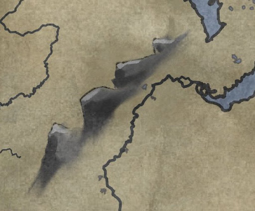
Thanks for your feedback. So far I have put either option aside to explore alternatives. Right now I have looked at a more ink-painting or printing style, which would match the line style of my outline. It's not perfect yet. This one is monochrome and I have not yet developed the matching forest model. Colour could be applied as a fuzzy water-colour fill.
Yet another model is a frontal view of a mountainscape aligned with the chain's orientation (regardless of the map's orientation), which gives it a medieval look, although the paint is a bit impressionist / dirty, which makes it less so. Here are samples, let me know what you think, thanks
Ink-like:
Scape-like:

Last edited by jesuisbenjamin; 07-03-2011 at 10:19 AM. Reason: added scape-style
Hmm, that second one is making me want to tilt my head 45 degrees to the left....I don't know if I can take it. I do love the look of the painted mountains though...just might have to straight them up with the top of the map for me.
When its over and you look in the mirror, did you do the best that you were capable of? If so, the score does not matter. But if you find that you did your best you were capable of, you will find it to your liking. -John Wooden
* Rivengard * My Finished Maps * My Challenge Maps * My deviantArt