Results 1 to 9 of 9

Thread: Lost Shrine

  1. #1
    Guild Member Kagehito's Avatar
    Join Date
    Mar 2008
    Location
    The Northwest
    Posts
    64

    Post Lost Shrine

    Ok so this will be my first Post ever here! Woot!

    So if its craptacular, then let me know!

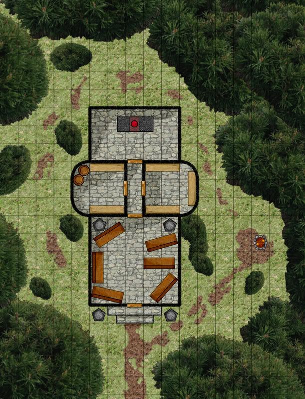
    Preface, Old forgoten temple, now inhabited by a maurading pack of Gnolls.


    Note! I have no actual training whatsoever in graphic design except one photoshop calss way back in high school. Just years of gaming and drawing of graph paper.

    Please tell me what you think, and any techniques and stuff you've found that work! Good filters and whatnot that are free would be healpful as well.

  2. #2
    Guild Member Kagehito's Avatar
    Join Date
    Mar 2008
    Location
    The Northwest
    Posts
    64

    Post

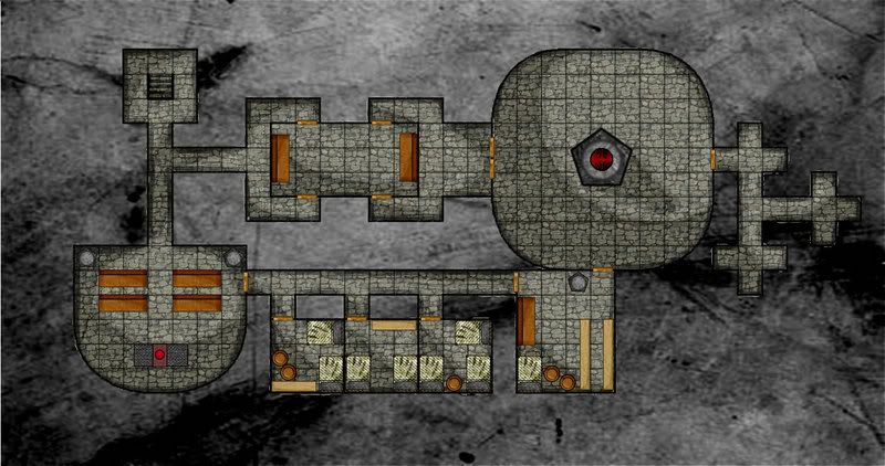
    Then of course the alter moves and you get the underground "True Dungeon"


    So before anyone asks, what did you use to make this?

    I made it from scratch, using macromedia Fireworks.
    It took a great number of hours, cause like i said previously, i have no real training, and had to teach myself as i went along.

  3. #3
    Community Leader pyrandon's Avatar
    Join Date
    Feb 2007
    Location
    Michigan, USA
    Posts
    1,341

    Default

    Hi, Kaegehite--and welcome to the Guild. If you ever feel so inclined, please post an intro in the Member Introductions forum; we'd like to get to know you better!

    This is a fine first map post. Good job. I like a lot of what you've done. Before I give specific suggestions, can you say what program you used? (was it Photoshop, since you mentioned one class & asked for filters?)

    In general, though, I think the first thing to find is a way to either make the trees less realistic or the temple more realistic; right now it appears you have a line drawing on a photograph, so they clash in style. Something to think about.

    Once again, welcome to the Guild!

    EDIT: hahaha. In the time it took me to post this, you already answered the program question AND posted a second map! Your new nickname: Speedy Gonzales!

    Fireworks does pose problems for me because I know nothing about that software. (I own it, but have never used it!)
    Last edited by pyrandon; 03-09-2008 at 04:39 PM.
    Don
    My gallery is here
    __________________________________________________ _______
    "Keep your mind in hell, but despair not." --Saint Silouan [1866-1938]

  4. #4
    Community Leader Facebook Connected Badger's Avatar
    Join Date
    Feb 2008
    Location
    Morton, TX
    Posts
    1,473

    Default

    heh... I missed it the first read through... but read it again.. he says what he used
    Have Pen. Will Map.
    Have Dice. Will Travel.
    GM for Hire | Artist and Cartographer | Free Quotes on

  5. #5
    Guild Member Kagehito's Avatar
    Join Date
    Mar 2008
    Location
    The Northwest
    Posts
    64

    Post

    Lol

    *pokes post you must have missed*

    you didn't see the second one did you?

    Anyway sure! I'll go post in the new members forum right now!

  6. #6

    Default

    Hi Kaegehite, Nice first post.

    Looks like you have a good eye for shading there. Where is the clipart from?

    I think Don got it right, consistency of style is what takes a map up to a new level...

    -Rob A>

  7. #7
    Guild Member Kagehito's Avatar
    Join Date
    Mar 2008
    Location
    The Northwest
    Posts
    64

    Post

    Clip art? If you are talking about the trees, its actually image shot from above a patch of trees if i'm not mistaken.

    I erased the stuff around it then used a bunch of copy paste to splat it around everywhere.

    Then i used a picture of grass, a picture of a stone wall, and a picture of a pile of dirt for the textures of the ground.

    After that I Made all the other things i think in Vector lines, and added them to my symbols so i can use them all the time.

    For the shading I used the freeform selector, and drew the areas to shade, and hit it with the burn tool to darken it up.

    That way it only effected the areas i had selected.

  8. #8

    Default

    Sorry! I was thinking that the vector art was from the dundjinni forums or from CSUAC.

    (Mainly because the style was different from the background textures - i.e. realistic vs diagrammatic).

    If you are willing, you could post some of the objects in the Mapping Elements forum

    -Rob A>

  9. #9
    Guild Member Kagehito's Avatar
    Join Date
    Mar 2008
    Location
    The Northwest
    Posts
    64

    Post

    Actually, I would love to do that! Give what I made back to the community!

    Thanks for letting me know!
    The pen is truly mightier then the sword, for with one quick stroke, a pen can kill your drawing; but the sword takes a couple hits before you drop it into negitive HP.

Posting Permissions

  • You may not post new threads
  • You may not post replies
  • You may not post attachments
  • You may not edit your posts
  •