Looks like a good start, you may want to try a bit of shading where the rocks meet the water to show that they extend below the surface.

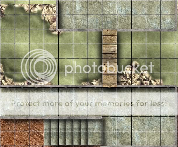
I have recently taken up virtual table top Dnd and am working on a encounter map to use.
After trying different things and tutorials I am closer to being happy with it but still a long way off.
One of the biggest things that I dont like is the elevation . As you can see or maybe now that I can interprut is a wooden bridge going over a little stream/ body of water. The height difference should be about 20ft .. You cant tell from this...
Also my wooden bridge looks like a plank at best and not a swinging suspension bridge
I will digress and hopefully let you map sages thrash me with your knowledge..
Thanks again
Traok

Last edited by traok; 11-04-2010 at 10:44 PM.

Looks like a good start, you may want to try a bit of shading where the rocks meet the water to show that they extend below the surface.
My Finished Maps | My Challenge Maps | Still poking around occasionally...
Unless otherwise stated by me in the post, all work is licensed under a Creative Commons Attribution-Noncommercial 3.0 United States License.

Hey thanks for the comeback, I worked on some today... Still seems wrong.. I know the upper left needs something and maybe a sewer grate or something at the lower right ..
Still need to figure out how to make a top down ladder...
Any thoughts, comments, concerns, or down right flammin

Heya. Welcome to the Guild! Battlemaps are an unusual animal - I've been learning about them myself lately. I grabbed your image and made some notes and suggestions:
1) The red box in the upper left corner shows where it looks like there are some rocks missing. If you can't recreate them maybe you could drop a strip of your grey concrete material there and make that the edge of a connecting building.
2) Your height problem can be partially solved by adding a shadow to the blue area I've scribbled in. If your horizontal walls on top are casting a shadow as long as shown then this 20' tall wall should be casting a correspondingly longer shadow on the water's surface. Also, the bridge has a blurry shadow extending off of both sides. It instead should be shifted off in one direction or another.
3) Speaking of that, one general issue is that your lighting is a bit confused. The vertical wall on the top building is casting a shadow to the right, while your steps are casting shadows to the left (except for the top step, where it seems reversed). I always find it handy to pick a direction and draw an arrow on my map (in its own layer) so I always remember where I've decided the light is coming from.
4) The bridge looks like it's sitting on top of the horizontal walls. If you put some wall shadow on top of it I think it'll recede to floor level. The green hashes indicate roughly where that should go.
5) The red on the stairs shows some serious repeats in your texture. It's a bit of work but they'll look better if you grab different sections from your concrete texture for each stair. Also, I've marked the bridge planks in red. They're a bit large and out of scale with the rest of the map. Scaling them down to about the size I've indicated might help a bit.
6) Finally, I've marked the edges of the rocks with purple hashes. Your shading helped some but I think you could get a better effect if you play with extending the rock texture out (about as far as I've indicated) and putting them beneath the water layer...but make the water semi transparent in the purple area...from full opaque on the inside to mostly transparent on the outside. This will let the rock show through the water. You can darken the rock to differentiate deepness as well, but you might need to play with the brightness of the water to get things to match up correctly.
7) Well, one more thing I didn't mark: How about adding a little shading to the rocks to make them pop as 3D? Just a hint of shadow on the side away from the light and maybe a bit of highlight. Just a thought.
Hope this helps out!
M
Last edited by mearrin69; 11-05-2010 at 12:55 AM.


well, Mearrin just about said it all - great comments M
However, to get a more hanging effect on the bridge I'll suggest "squeezing" it slightly on the middel to give the illusion of that section being lower than the ends. In addition to that leave some space between the boards as they wont be tight together in a suspension bridge, and add some ropes to hold on to when you pass it and some ropes below the boards that the bridge is resting on.
great looking map - and have some rep for your first upload
regs tilt
:: My DnD page Encounter Depot free stuff for your game :: My work page Catapult ::
:: Finished Maps :: Competion maps - The Island of Dr. Rorshach ::
:: FREE Tiles - Compasses :: Other Taking a commision - Copyright & Creative Commons ::
Works under CC licence unless mentioned otherwise
I Googled "dundjinni bridge" for you and got some results for you:
http://www.dundjinni.com/forums/foru...0269&KW=bridge
http://www.dundjinni.com/forums/foru...s.asp?TID=1244
Here's a blog that talks about making a rope-and-plank bridge: http://newbiedm.com/2009/11/17/newbi...emap-part-iii/
Doesn't go into much detail, though.

WOW.... Thanks so much for the input fellas.... I will post more as soon as I heed the advice
/cheers
Traok