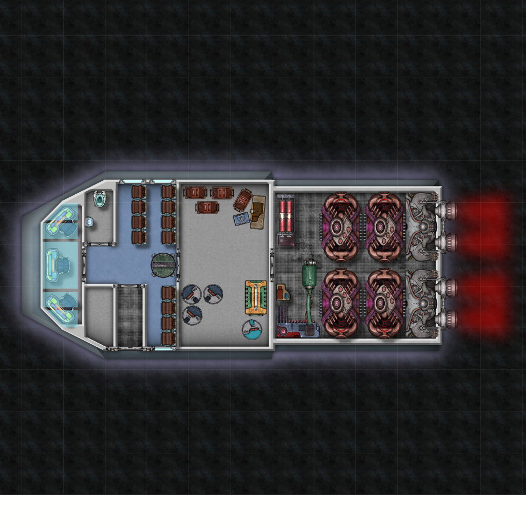
Would there really be a bathroom like that (with a toilet) on a shuttle? Just askin'
-Rob A>

The idea is for a compact short-endurance (< 24 hours) civilian utility craft that emphasizes speed over passenger or cargo capacity. It is intended for routine errands and a variety of short-run tasks carrying both passengers and cargo from ship-to-ship and ship-to-surface. I have designed and stated it out as a 20 dton gig in the GURPS Traveller Starships design sequence.
The design is all done. The deckplan, however, is very much a WIP. Here is the first draft. I am pretty happy with the layout, but need to tweak a lot of the little things. The blank area behind the cockpit is going to be a ships locker. The background, walls, shadows, and glow effects especially need some work.
Any comments and criticisms would be welcome.

Last edited by vmat2; 11-20-2011 at 07:40 AM.
Would there really be a bathroom like that (with a toilet) on a shuttle? Just askin'
-Rob A>
My tutorials: Using GIMP to Create an Artistic Regional Map ~ All My Tutorials
My GIMP Scripts: Rotating Brush ~ Gradient from Image ~ Mosaic Tile Helper ~ Random Density Map ~ Subterranean Map Prettier ~ Tapered Stroke Path ~ Random Rotate Floating Layer ~ Batch Image to Pattern ~ Better Seamless Tiles ~ Tile Shuffle ~ Scale Pattern ~ Grid of Guides ~ Fractalize path ~ Label Points
My Maps: Finished Maps ~ Challenge Entries ~ My Portfolio: www.cartocopia.com
Looks cool. I dig the graphic style...the rear half reminds me of a few of the old Amiga videogames. On the toilet, maybe it has good antigrav and inertial dampers.
M

Very good point. That is the ubiquitous Traveller “fresher”, a combination toilet, shower, and sink. It would be bad form to have twelve paying passengers cooped up for almost a day without any facilities. Fortunately, the technology level includes grav plates and inertial dampeners.
Still, I think I will go in and edit the toilet and sink symbols to remove the blue water layer. This way there won’t be any messiness in the case of turbulence

I have tweaked some things from the cargo hold forward and am pretty happy with the result. I made another view of the fresher showing "toilet and sink mode" in the shuttle and "shower and washer/dryer" mode in the offset. The toilet folds into the lower section of the compact washer/dryer when not in use. The sink and shower fold up as well. I decided to leave the water effects alone. Because after all, paying passengers expect 1g and normal "facilities".
Next up is the engineering section. When this is all done I plan to insert isometric top/front/right side exterior views behind the deckplan.
ship4.jpg
P.S. and I finally figured out how to work the attachment button
Last edited by vmat2; 10-10-2011 at 12:29 AM.


pretty neat vmat2, love the style
regs tilt
:: My DnD page Encounter Depot free stuff for your game :: My work page Catapult ::
:: Finished Maps :: Competion maps - The Island of Dr. Rorshach ::
:: FREE Tiles - Compasses :: Other Taking a commision - Copyright & Creative Commons ::
Works under CC licence unless mentioned otherwise

Nicely done.
My Finished Maps | My Challenge Maps | Still poking around occasionally...
Unless otherwise stated by me in the post, all work is licensed under a Creative Commons Attribution-Noncommercial 3.0 United States License.

It took me awhile, but I think I am mostly finished now. I made some untextured exterior views with Sketchup and added some display graphics. I am pleased with how it turned out. Any suggestions to improve it would be welcome.
ver2.PNG


a bit in-your-face with the neon colors, but other than that this turned out really well.. so here's a reward from my Blaster of Slamming repping
regs tilt
:: My DnD page Encounter Depot free stuff for your game :: My work page Catapult ::
:: Finished Maps :: Competion maps - The Island of Dr. Rorshach ::
:: FREE Tiles - Compasses :: Other Taking a commision - Copyright & Creative Commons ::
Works under CC licence unless mentioned otherwise
As tilt said the text is pretty in your face. I figured out a pretty easy technique for monitor graphics while working on a recent map. Put everything you want the effect on in one layer with black background, duplicate the layer, blur the dup, lower the opacity, make a new layer on top and fill it with the smallest horizontal line patern (used Gimp but I'm sure PS has a similar pattern), lower the opacity on the pattern layer, and flatten all three layers. Put the new layer over your main image and set it to screen, addition or whatever works for you.