Reply With Quote
This is coming on really well, Straf
Shading is always tricky. Don't give up. The shading can be as dramatic or as subtle as you like

This is coming on really well, Straf
Shading is always tricky. Don't give up. The shading can be as dramatic or as subtle as you like
Free parchments | Free seamless textures | Battle tiles / floor patterns | Room 1024 - textures for CC3 | GUILD CITY INDEX
No one is ever a failure until they give up trying
It looks good to me. Depends on whether you wanna remove the lines or not (and I'd love to see it without the lines).


Doesn't look heavy to me. I like where this is going.
Sent from my LG-M250 using Tapatalk


I concur with others, looks just fine the way it is. Glad to see you mapping again, dude!
Looks great Straf, you could turn down the opacity on the shading a touch on the highest peaks if it bothers you, but I think it looks quite nice as is, and I really like the versions with the numbers I hope you'll put some in for the finished version it seems more authentic that way, and I love the colours, it looks really good so far.
Last edited by kacey; 02-17-2018 at 01:49 AM.
Like Thomas sad : it really depends on wether you’re keeping the lines or not
I think the shading looks just fine. I feel like I'm going hiking wherever this is and this is my reference map. I can't imagine how much time all those contours took.
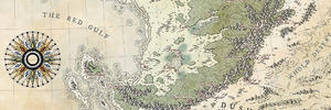
I've been messing about with a bit of colour and some highlighting to see how it might look. Any comments?
Ferryman.jpg
Er.... umm....
I think its a bit dark, possibly?
Maybe that's just because the 'OSy' style contours were leading me to think that you were going to stay fairly pale with this one?
I'd go at least a couple of shades lighter with the land colours, certainly.
Free parchments | Free seamless textures | Battle tiles / floor patterns | Room 1024 - textures for CC3 | GUILD CITY INDEX
No one is ever a failure until they give up trying
 Posting Permissions