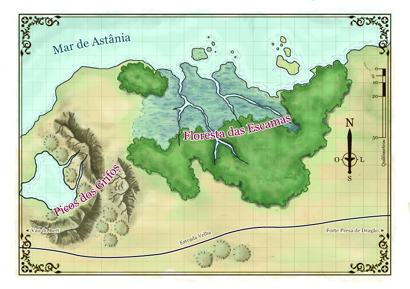
looks very good - nice clear colors and elements.. the hills remind me of forgotten realms... have some rep for your first upload


Hi!
This the first map I completed. This is a player's version, it doesn't show spots of interest. The complete version is still in progress, so I'll show later.
What do you think about it? Comments are welcome!


looks very good - nice clear colors and elements.. the hills remind me of forgotten realms... have some rep for your first upload

regs tilt
:: My DnD page Encounter Depot free stuff for your game :: My work page Catapult ::
:: Finished Maps :: Competion maps - The Island of Dr. Rorshach ::
:: FREE Tiles - Compasses :: Other Taking a commision - Copyright & Creative Commons ::
Works under CC licence unless mentioned otherwise

Very nice, I wish my first attempt looked even remotely like this. Only thing I'm less enthused about are the hills.

I'm with Tilt, very Forgotten Realms-esque.
My Finished Maps | My Challenge Maps | Still poking around occasionally...
Unless otherwise stated by me in the post, all work is licensed under a Creative Commons Attribution-Noncommercial 3.0 United States License.


Isn't it Schley who does the FR maps? Nonetheless, this is nice and reminiscent of that style. Good job.
If the radiance of a thousand suns was to burst at once into the sky, that would be like the splendor of the Mighty One...I am become Death, the Shatterer of worlds.
-J. Robert Oppenheimer (father of the atom bomb) alluding to The Bhagavad Gita (Chapter 11, Verse 32)
My Maps ~ My Brushes ~ My Tutorials ~ My Challenge Maps
Looks Good. FR or not its a very nice looking map. Can't wait to see the version with all the interesting details....
In the words of Most interesting man in the World. "Stay thirsty my friends."
Unless otherwise stated by me in the post, all work is licensed under a Creative Commons Attribution-Noncommercial 3.0 United States License.
Great job!
Cheers,
-Arsheesh

Thanks guys.
Actually, I'm really inspired by the maps of Forgotten Realms and Dragonlance of 3E. I think this kind of map is the most accurate for me, because the top view of mountains and hills. If I draw them in other way, it looks like is missing something behind. Also, I'm big fan of Rob Lazzaretti and Schley, so my maps look like their naturally. But I really would like to draw a map with "pencils + digital colors technique", like Cary Nord's drawings in Dark Horse Conan comics, you know? I think that gives a great mood to the maps.
What do you think I could do to improve the hills?
And about the ground? I miss some texture, don't you?
This looks excellent! How do you make those very beautiful mountains and woods! Is this hand drawn?
I am an Artist. Avegost is my art. I'm always actively trying to make Avegost better.