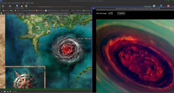
the storm looks like Saturn's NorthPole storm
http://www.ciclops.org/view/7620/North-Polar-Movie


Compleate elements Bright small for email.jpg
The big magic storm in the middle was added per request of Patron
the storm looks like Saturn's NorthPole storm
http://www.ciclops.org/view/7620/North-Polar-Movie

--- 90 seconds to Midnight ---
--------
--- Penguin power!!! ---
Cool map. Nice colors. The north-south passage is an interesting feature.
My Battlemaps Gallery http://www.cartographersguild.com/al...p?albumid=3407
Yes I think it looks great. I think the national boundaries might be clearer in yellow or red, possibly dashed.
Very nice work with great colors! I second Larb about boundaries and would probably use a "less button" style for the cities. I really like the general land shape.
Nice job on this Daniel! The colors are very vibrant. One recommendation would be to tone down the contrast on the texture of your background parchment layer; it's a little bit busy. Also, borderlines might help to embellish the map a bit. Nice work though.
Cheers,
-Arsheesh


That world cyclone looks terrifyingGreat first map, you have alot of talent! I also second Arsheesh's comment!
www.jaredblando.com
Freelance Cartographer/Conceptual Artist
:My Patreon Account:
https://www.patreon.com/JaredBlando
:My First Book: How to Draw Fantasy Art and RPG Maps: Step by Step Cartography for Gamers and Fans
:My Second Book: Fantasy Mapmaker: How to Draw RPG Cities for Gamers and Fans
A good map, in my opinion, but when I first saw it I mistook the national boundaries for rivers and was going to call the river police. So I agree with Larb's comment.
If you didn't purposely choose an oil painting style for you map, you should also follow Arsheesh's good advice.