Reply With Quote


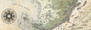
I think the reason it feels a little empty to you is that it IS empty. Once you start adding in cities, towns, text, etc, you'll be surprised at how much it helps break things up. One thing you could definitely do would be to add one or more layers to your land components that have different textures, then mess around with the layer style type until you find something, some combination you like.
If you look at that map of Max's that you referenced, he actually managed to cleverly avoid having to do a lot of that by having landmasses that were much smaller and so only needed a tiny bit of texturing here and there to give it some oomph. Most of the heavy lifting is done with text. I think you're going to have to rely a bit more on texture since you've got a LOT more open land spaces. One thing I would say is, if you do decide to add more texture, try to keep it consistent across the whole map, just varying it subtly/slightly for places like badlands and deserts - don't use jarring changes in appearance as (to me, anyway) it really takes you out of the immersion.
But, I do like what you've got so far - nice layout, and your mountains are the bomb.